Volume 3 of my weekly roundup of visualizations, news and tweets in Civic Tech. The week was packed with great civic visualiations and fewer articles. Topics include Snow Clearing in Canada, civil forfeiture in SC, Cincinatti Heroin Incidents and more.
Visualizations
This week we had plenty of great civic data visualizations and data stories from newspapers. That really made me happy :smile:
Snow clearing complaints in Kitchener
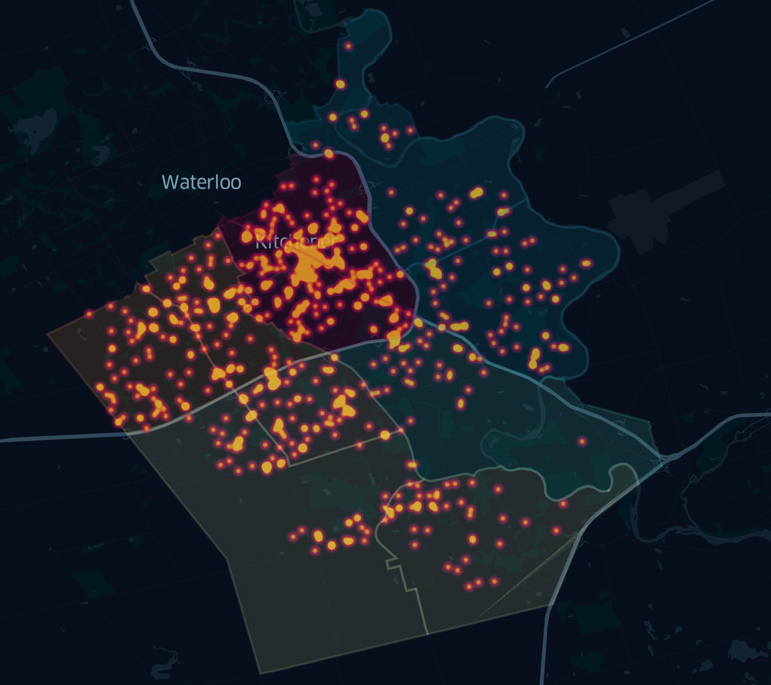
Mike Boos did an excellent visualization about sidewalk snow clearing complaints from 2008-2018 using Open Data from City of Kitchener, Ontario, Canada
The colors stick out and make the visualization compelling to look at. Morevoer, it also is a great starting point for discussions. As Mike pointed out:
This dataset must not be complete - only 807 complaints over a decade is at least an order of magnitude too small, considering a staff report said winter of 2015/ 2016 alone, which was ‘unseasonably mild’ had 902 complaints.
This is a common problem I see with Open Data. Although it is published, it is not always complete nor clean.
Here are sidewalk snow clearing complaints from 2008-2018, mapped onto ward boundaries. pic.twitter.com/iPlFMvJSEJ
— Mike Boos (@mikeboos) January 26, 2019
Polar Vortex
Stunning visualization from Tim Wallace using GFS forecast data. It has gorgeous colors and almost looks like art. I would print this out and hang it on the wall. Also, there are plenty more where this awesome thing came from:
Found a NOAA ftp with GFS forecast data. So I could, you know, check out that 🌀❄️polar❄️🌀❄️vortex❄️🌀 everyone's talkin about. ftp://ftp.cpc.ncep.noaa.gov/GIS/gfs_0.25/ pic.twitter.com/IU1JQKrRkB
— Tim Wallace (@wallacetim) January 29, 2019
TAKEN: How police departments make millions by seizing property
Anna Lee and Nathaniel Cary and Mike Ellis from The Greenville News spent 2 years reporting and looking at every civil forfeiture in SC.
It is a great article, very lengthy and very detailed. It has some visualiations in it but they’re more hidden. You need to click on the dots of the map to see them.
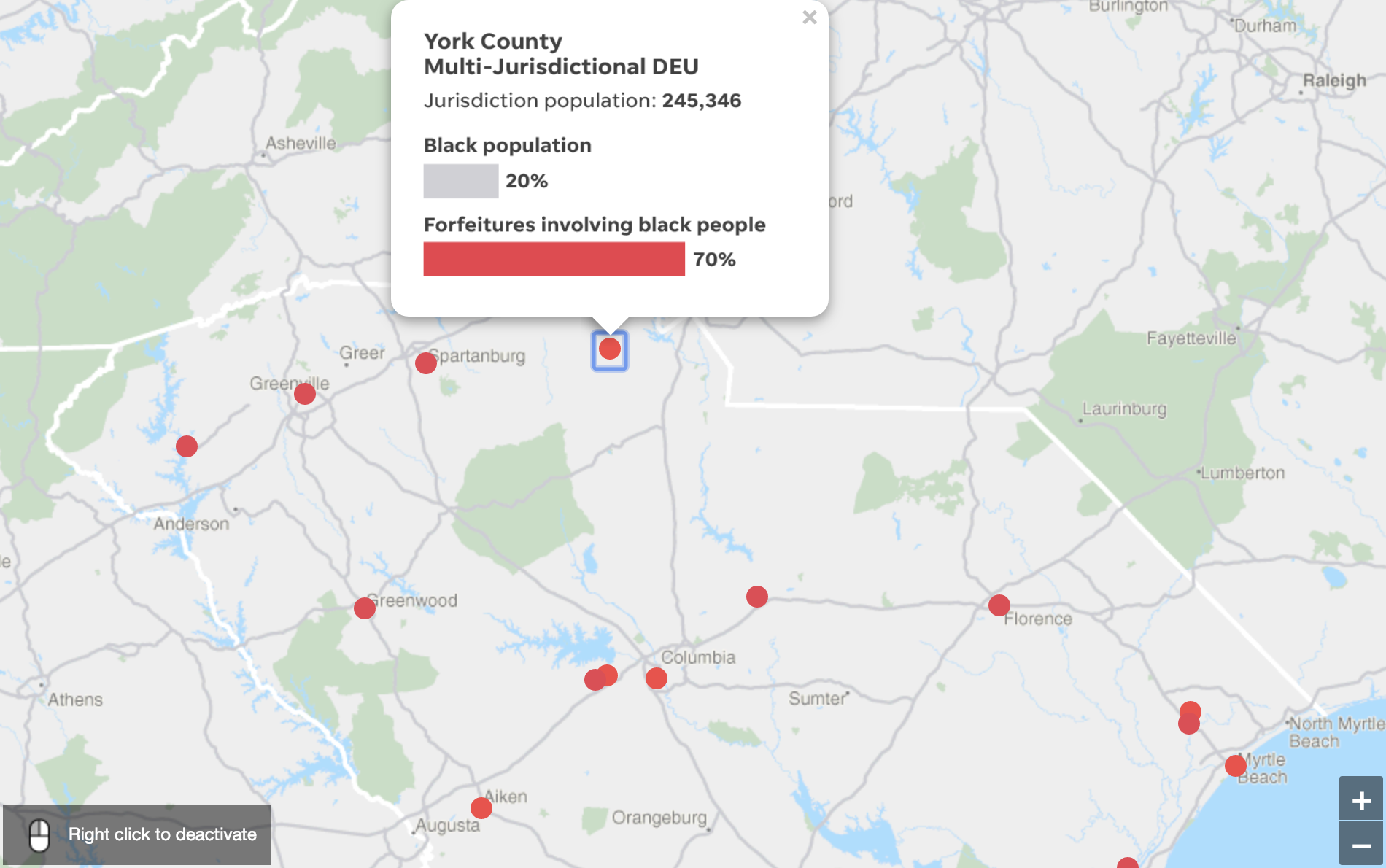
I would have loved if they would include those graphs into the story because they’re very powerful. And they’re very clean as well which makes them easy to read and to understand.
The one critique that I have is that the map does not include Attribution where the data/basemap is coming from.
Cincinnati Heroin Incidents
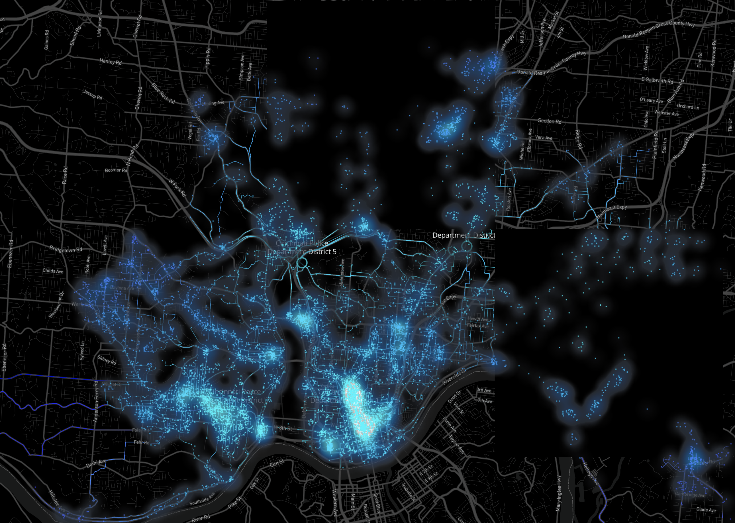
Recent work is done with Mapbox in Tableau Public by Allan Walker (@AllanWalkerIT) for the Cincy Tableau User Group meeting.
I admit I like black as a background color if you want to make your data the central part. It makes it easier to see the data, but you lose a little bit of the location context. This is a drawback you need to think about. But I think in this visualization it serves its purpose.
It is a nice starting point to lead a discussion, and that seems to be the intent as suggested in his tweets.
I could not find the source dataset, but he said in that (embedded below) tweet it was using Open Data, so I suspect this would an Open Dataset published by the City of Cincinnati.
It seems to be data from 2016 - 2019 but again, no detailed information was provided.
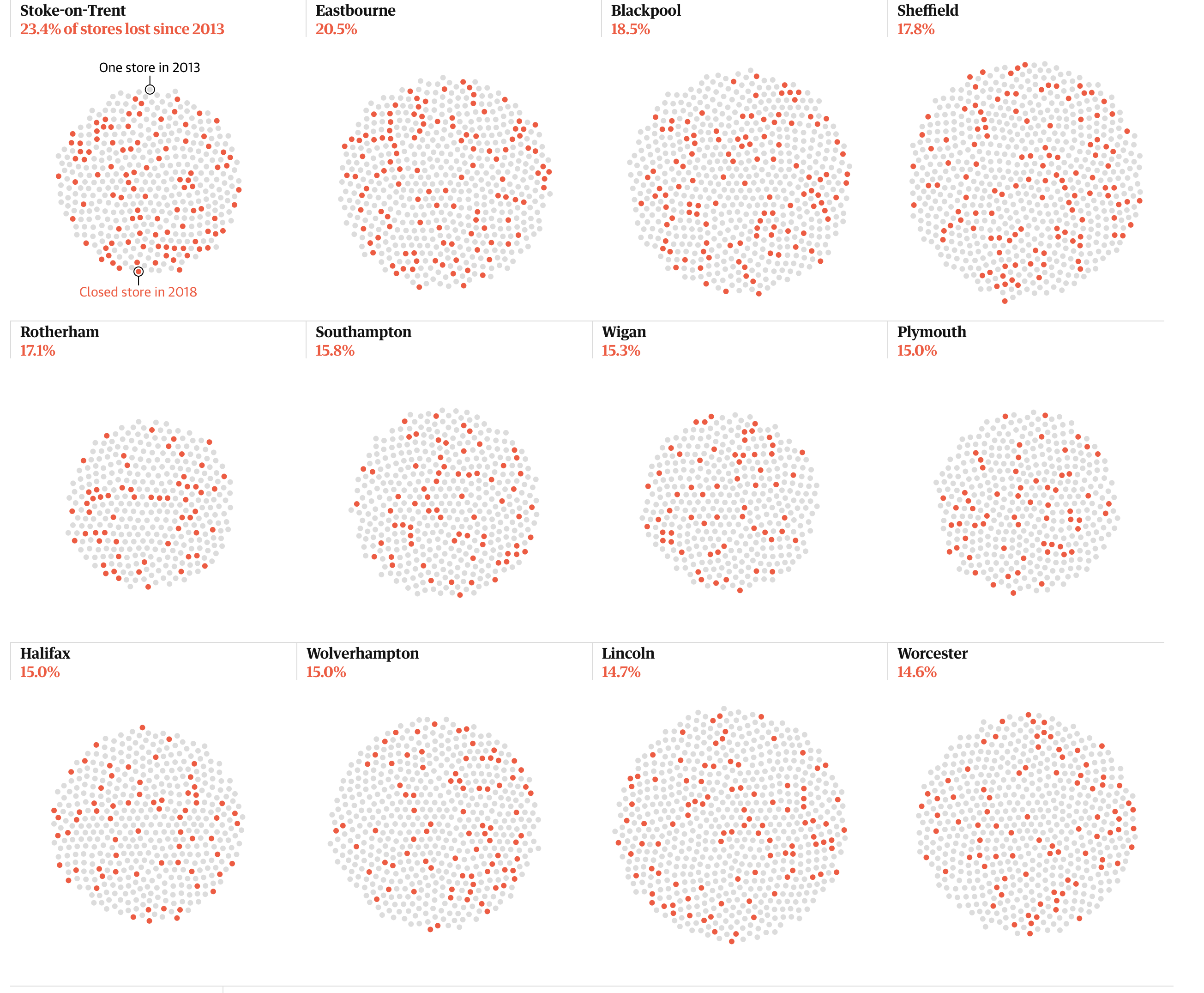
1 in 12 shops closed in five years: England, UK
88 major town centres across England and Wales were included in the Guardian’s analysis of Ordnance Survey data.
This is a lovely and well rounded data story with nicely done visualizations that help understand the problem of declining shops in England.
What I think stands out is the added section at the end of the article about their Methodology. I think everybody should include that (myself included).
How Illinois Bet on Video Gambling and Lost
A great lengthy story from ProPublica and the Chicago Sun-Times about gambling in Illinois. The story is part one of a multi-part story, and it has just a few visualizations in it. I love ProPublica’s lengthy (data) stories and use of visuals and visualizations.
Legalizing video poker and slots was supposed to generate billions of dollars for the state. A decade later, that hasn’t happened. Now, legislators want to double down on gambling.
The story is a deep dive into the data involved and has a big map in the middle of the story:
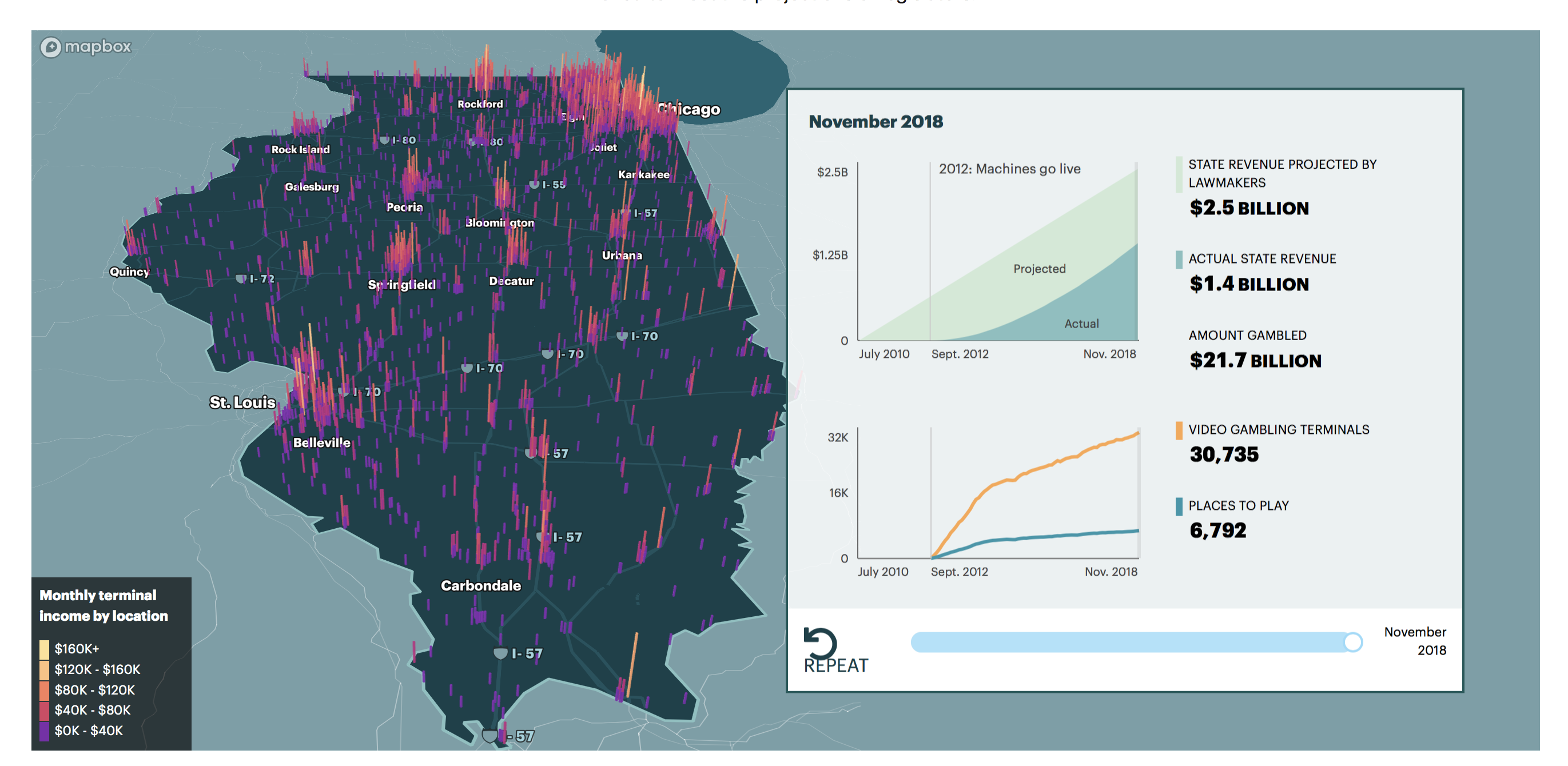
I’m not sure if bar charts inside the map and the 3D look help in understanding the data. I think the color usage is excellent, but I think a hexmap would have worked a little better.
The map has a few visual flaws which I should dive into more in-depth in a separate post.
They included some animations in it which are cute but make the underlying data hard to read without stopping the animation.
If you look closer you see a nice visualization about the projected and actual revenue:
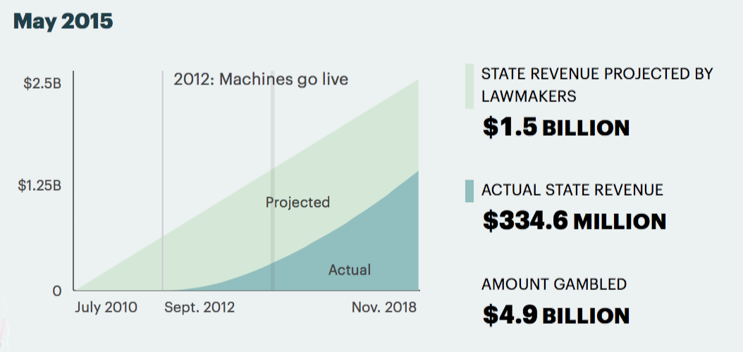
It’s hard to see but it indicates the year in the graph as well, and you can click on it. Nice big numbers show the projected revenue and the actual. Would have loved to see the actual difference (I can calculate, but it’s tedious for every year).
The amount gambled is not as interested in me in being honest so that I would have left that out.
What is great about this story is that they included their methodology at the end as well.
Open Data
City of Kingston Open Data Portal
A new city is welcomed to the Open Data family. The City of Kingston in Canada launched a new Open Data Portal. They’re using OpenDataSoft.
How Los Angeles Controller Ron Galperin Brings Data to Life
Some awesome quotes from him and the article on Socrata’s Blog.
Galperin’s mission is to bring that data to life.
What a great statement and this should be ingrained in every government.
Galperin focused on _The Three Ts_— transparency, trust, and transformation.
They mapped a year of domestic violence reports, and the result was a change in Policy. Before the domestic violence programs were underfunded, disjointed, and inconsistent, after his effort:
“We all have an incentive to try to do something about it,” he said. “Today we do have a domestic abuse response team in every police division.”
“We’re trying to do more than just look at numbers, but also how we present it,” Galperin said.
New York City, St. Petersburg, Fla., Ramp Up Data Storytelling
The city of St Petersburg Florida was using mapping to find areas where the most code violations were occurring. Using storytelling, they were able to show workload of code investigators and get upper-level buy-in. The result was a redraw of the districts to make better use of resources.
Better software has made the job of interpreting and analyzing city data easier.
Articles
- Winter Haven, Fla., Looks to Smart City Opportunities
- Why user researchers and service designers should be best friends - User research in government
- Why we’re so impressed by Argentina’s digital services team – Public Digital
- Data Foundation report reveals overwhelming optimism about the state of open data - FedScoop
- How will Ottawa build a successful digital government?
Tools
🎉 Our new developer @sjockers built his first feature: Our dot plots & stacked bar charts are now interactive! Your readers can now discover the smaller values in your charts. And the best thing: It's turned on by default. pic.twitter.com/KTNzMazbPR
— Datawrapper (@Datawrapper) January 29, 2019
Tweets
Good evening! I mapped all of the protected bike lanes in San Francisco and wrote about how their sparsity reflects a lack of vision. https://t.co/MfLfy6Fgu6
— ira (@irapolis) January 31, 2019
Union-Tribune ▶ Interactive map shows crimes around San Diego County https://t.co/rJXwKAXAOY
— SD Newsfeed (@SDNewsfeed) January 31, 2019
We're so excited! TODAY we launch the third #EUdatathon! Compete with your #app for one of the challenges! Deadline for submissions: 24 March ⏳https://t.co/yfFFPJkbn3 @ro2019eu @EULawDataPubs pic.twitter.com/tVxL2a2Xps
— EU Open Data 🇪🇺 (@EU_opendata) January 28, 2019
There is something really exciting brewing between @GISCorps and https://t.co/kfOQ0gxTGR - #searchandrescue #GIS #volunteers pic.twitter.com/J0cVIUx7Fv
— Paul Doherty (@pjdohertygis) January 26, 2019
NYC! #civictech + #opendata + robust oversight from @nyctaxi = safer streets. https://t.co/iezFNNQzKi
— noel hidalgo 🌹 (@noneck) January 29, 2019
Great idea for entrusting #opendata to those who know how to organize and manage data
— Datapolitan (@Datapolitan) January 28, 2019
Make public libraries custodians of smart city data: board of trade https://t.co/jUPWF3hond via @nationalpost
Using data sets from the local open data offerings @bouldercolorado challenged participants in its The Art of Data Infographic Contest to tell a story using original infographics and visualizations. Read more in this @govtechnews roundup! https://t.co/Iyuy9GNPnE
— What Works Cities (@WhatWorksCities) January 28, 2019
Agent Kay is a 24/7 AI-powered chatbot that can answer Kansas residents' questions about the state's online tax portal https://t.co/VCDXfDmww3 #govtech #civictech @ksgovernment pic.twitter.com/NU4TN2lXMT
— Govtech.com (@govtechnews) January 30, 2019
Local government finds itself on the front line of some of society’s most
— The Behavioural Insights Team (@B_I_Tweets) January 29, 2019
significant challenges. This year we worked to support cities across the US - read more in our annual update report: https://t.co/KeXnF4TQfh pic.twitter.com/xF7grCi8WM
I worked on these maps for @WorldResources displaying new research on how much cities have grown horizontally, and vertically (by analyzing satellite data on where buildings are being added). First two maps created w/ @f_l_o_u_r_i_s_h, third static map created w/ @qgis pic.twitter.com/uIBOndx8Ew
— carni_dc (@CarniDC) January 31, 2019