This week includes data visualisations about Trees in New York, Wildfires in California, Housing in Boston and Scooters in San Diego.
I’m still figuring out the best approach to it, and if you have any suggestions please let me know :)
Visualizations
NYC Street Tree Map
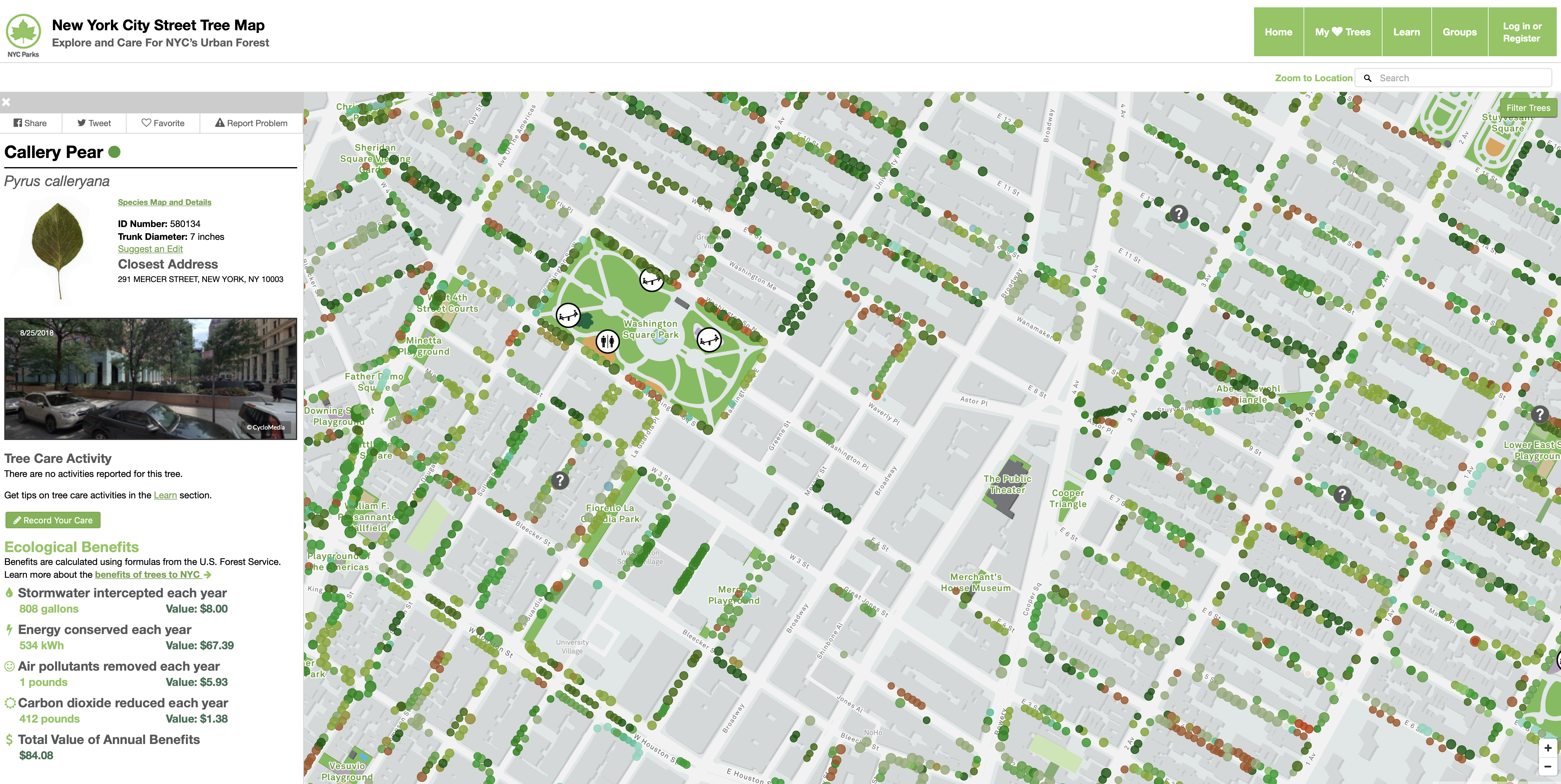
This one is not totally new but worth checking out and sharing.
The New York City Street Tree Map brings New York City’s urban forest to your fingertips. For the first time, you have access to information about every street tree in New York City. Learn about the trees that make up our city’s urban forest, mark trees as favorites and share them with your friends, and record and share all of your caretaking and tree stewardship activities.
https://tree-map.nycgovparks.org/
A History Of California Wildfires
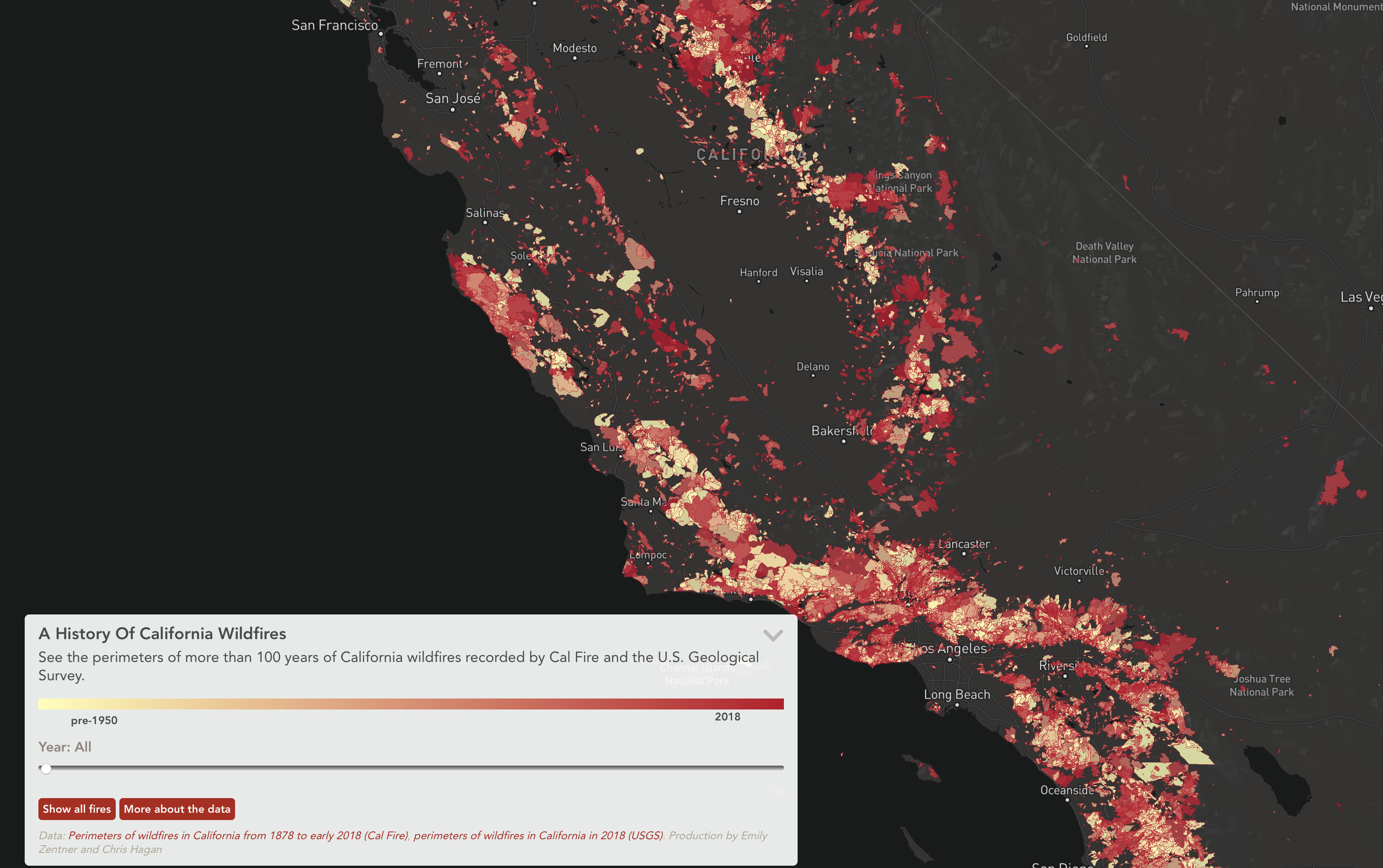
Capital Public Radio (CPR) mapped wildfires have from the last 100-plus years in California.
“A History Of California Wildfires,” uses data sets from the California Department of Forestry and Fire Protection (Cal Fire) (dating back to 1878), as well as the U.S. Geological Survey’s 2018 data set.
I love maps as you might have realized and this one looks great. It’s great that they included the source data and more information about its usefulness.
But I do not like the color changes. Especially with fires, you would assume that the red areas where the more severe but they’re the most recent one. And overlaying all of them looks kinda weird. But if you scroll to the dates is pretty intense. I would have used a time slider and a play button to show the severity of the fires. And I would use one color for all of them.
Maybe add a second color if you have more information to encode. Or add a heatmap to show the regions that are hit the hardest in the last 100 years.
A History Of California Wildfires
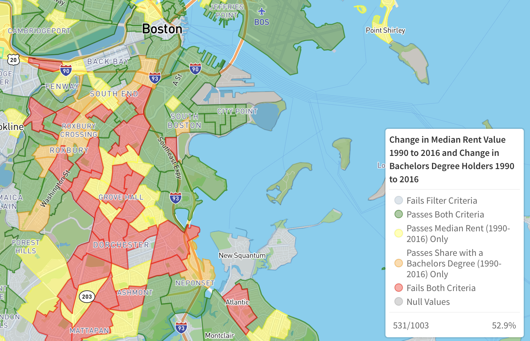
Boston Neighborhood Change Interactive Map
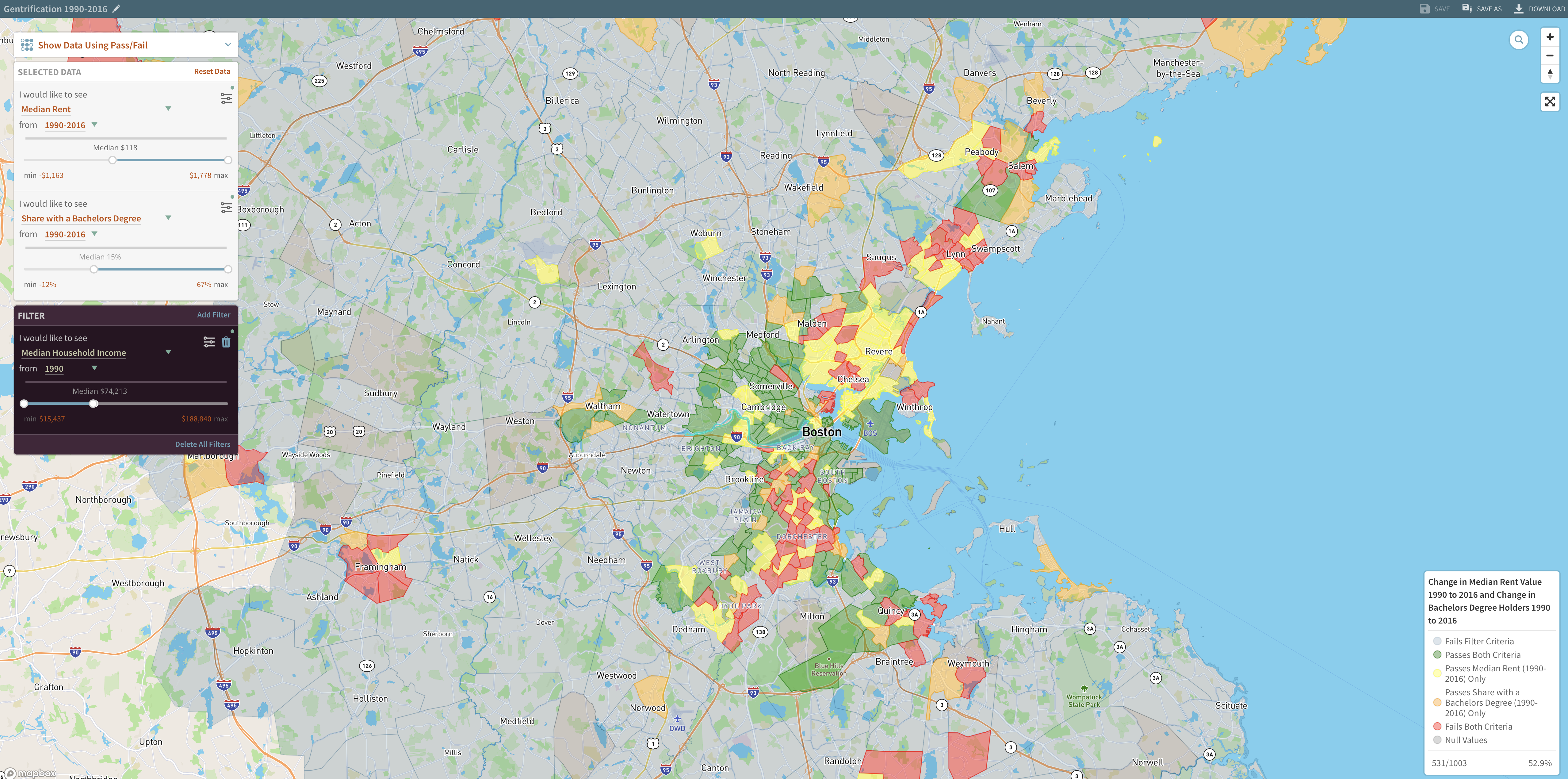
The Joint Center for Housing Studies of Harvard University has released a new Boston Neighborhood Change Interactive Map, which allows visualizations of demographic, social and economic changes in the Boston Metropolitan Statistical Area.
They offer a recommended maps section which includes maps about Racial and Ethnic Diversity, Modestly-Priced Homes and Gentrifying Neighborhoods.
I took a closer look at the Gentrifying Neighborhoods map. And it took me some time to figure them out. They have the typical red, yellow, green color scale, which makes it easy to spot good and bad parts. I would have wished more explanation. I clicked on Gentrifying Neighborhoods, but I am not sure if a green or a red district is gentrified. here is a detailed screenshot of the map:
While I’m writing this, I realise this should be a longer post diving into the visualisations more deeply. Keep an eye out for those posts in the upcoming weeks.
Motorized scooter tickets leap in San Diego
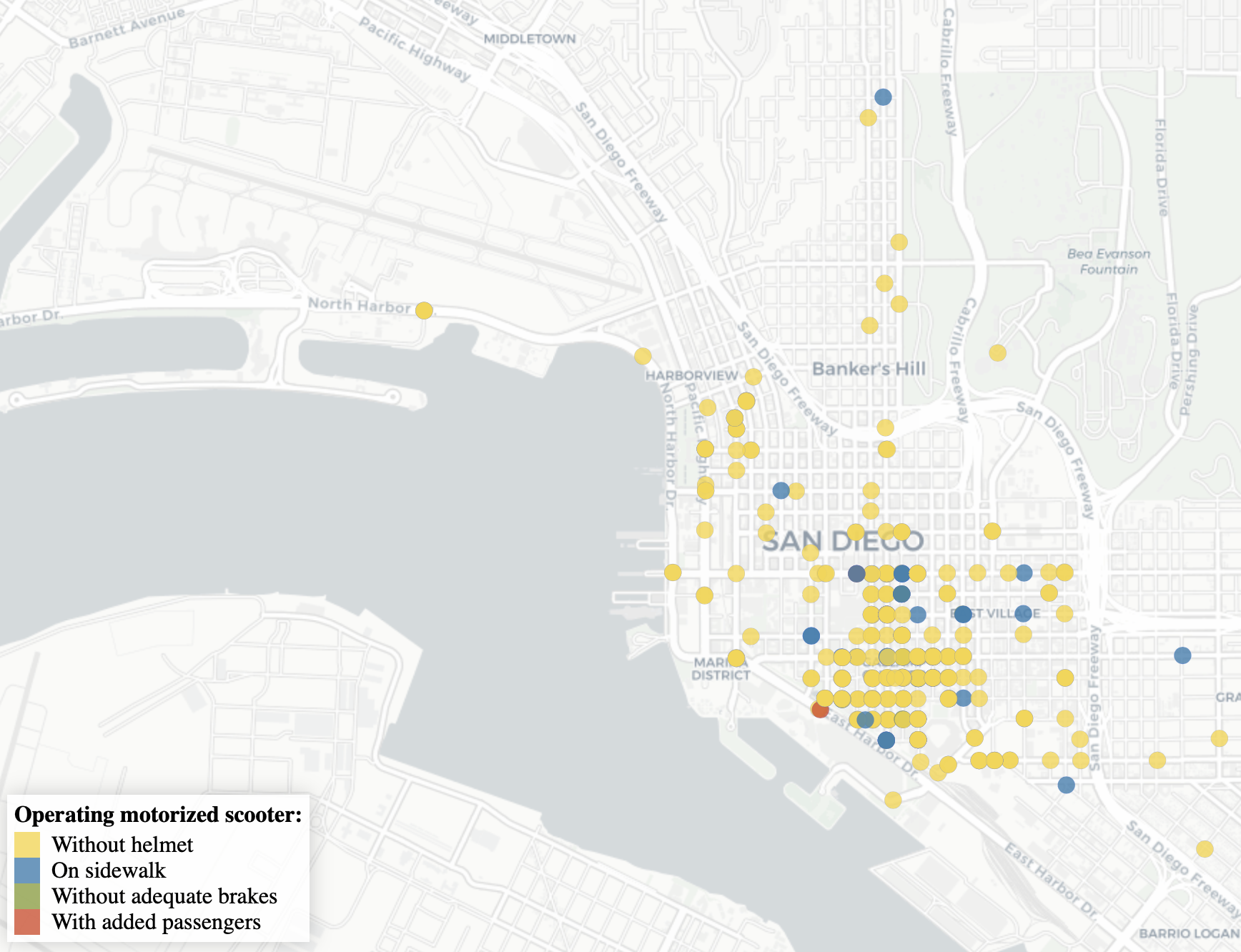
A news article from the San Diego Union Tribune about scooter tickets in San Diego.
San Diego saw a rise in Scooters and Scooter usage over the last year and I enjoyed riding the scooter there a lot :)
The article includes three visualisations and a map. The map naturally caught my eye.
It’s using Carto as a provider and therefore really great basemaps which help emphasize the data and not the streets. On a first glance at the map, you can see that most tickets were issued downtown and most of the scooters are in downtown San Diego. So no surprise there. I would have loved seeing actual scooter usage numbers, but we have to take what we get :)
One thing that stands out and could confuse readers is the color choice. They used red, green, yellow and added a blue. But the colors do not match the ticket description very good. You would not expect a green dot being a scooter without adequate brakes. But I applaud the Union-Tribune of using data analysis and visualizations to support their stories.
Chicago Pre-K Community Programs
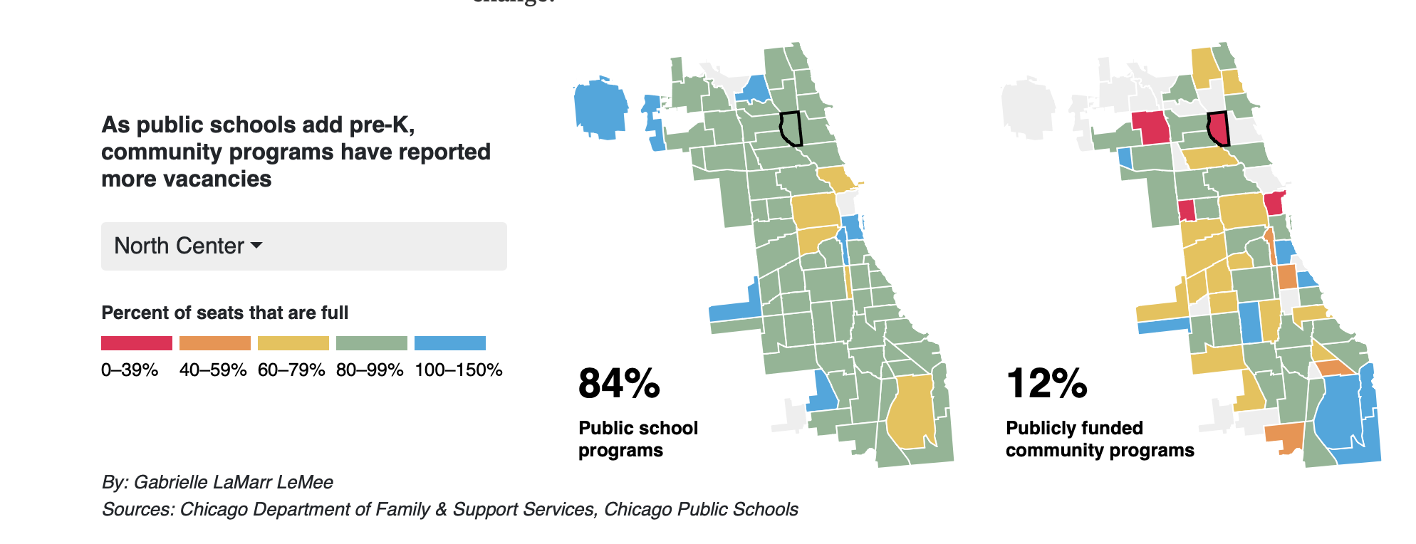
El Valor runs the second-largest network of early childhood education centers in Chicago, after the public school system itself. Until this fall, several of its centers on the city’s South and Southwest sides had long waitlists.
This article is about the change of then-Mayor Rahm Emanuel announcing that Chicago would embrace universal education for 4-year-olds. And community education Center El Valor struggles to fill its places.
I love the small multiples approach, showing seats filled at the public school and the community programs. The typical red, yellow, green color for empty to full works well and adding a fourth color in blue to show overcapacity works excellent. Especially since it stands out right away. The cited their source, but I would have loved to look into the data myself so a link to the source would have been even better.
Child care cost in the Bay Area
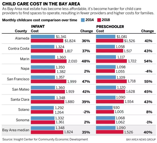
The article “You think Bay Area housing is expensive? Child care costs are rising, too” also includes a nice visual to show the change in cost.
I would have used less color and maybe even used a slope chart instead of the bar chart. It takes some time to see the rise and the percentages. They are huge, but the visual does not really support it. I will probably do a makeover of this one since it is fascinating data and could use a great visual.
Open Data
New Data: Portland Police Department
We have a nice new dataset from the Police department of Portland
#OpenData from the Portland Police Bureau (Use of Force, Auto Theft, Crime Stats, etc) - https://t.co/Dfn2Nh516c pic.twitter.com/BFZ5QYV1rx
— Portland Police (@PortlandPolice) February 4, 2019
Great thread from last week about illegal parking
New analyses of 311 "Illegal Parking" reports are up! Do you want to know _exactly_ how well your local officials actually respond to 311 reports of street safety problems? This is the thread for you! Open data is the best data. #placardcorruption #bikenyc
— Jake Schmidt 🥑 (@TheJakeSchmidt) January 31, 2019
The State of the Union of Open Data
93.6% of #SOTUofopendata survey respondents believe we’ll see an improvement in the standardization, sharing, & use of #opendata in the immediate future - 14.4% increase over last year! Learn what’s behind the numbers in our report
Baton Rouge, La., launches new open checkbook
Baton Rouge, La., launched a new open checkbook platform that allows residents and other visitors access to spending data for municipal departments and services.
Articles
Civic Tech/Community
- When It’s Hard to Make Ends Meet, Can Smart Apps Help?
- D.C. developers present futuristic traffic, environmental apps for civic challenge
- Seattle Nonprofit Builds App to Stop School Violence
- Beyond numbers: reuse of data to visualise gender gaps in the City of Buenos Aires
- Tech-savvy Samaritans create web tool for co-ordinating help for poor
- Managing the Many Moving (and Zooming) Parts of ZoLa
- Book chapter: Data for the Social Good: Towards a data activist research agenda
Open Government/Open Data
- Top Datasets for U.S. Cities
- Chicago PD Launches ‘Intelligence Hub’ in Logan Square Area
- Unveiling the Government of Canada's Standards on APIs
- Philadelphia Adopts Smart City Road Map
- Impactful open data through user research
- Detroit Counts on Tech to Prep for the 2020 Census
- Open Data and Entrepreneurship
- Chicago PD Launches ‘Intelligence Hub’ in Logan Square Area
- How Can We Improve Trust in Technology?
- Data Coaliiton releases Polcy Agenda 2019
- By the people: A new series on participatory service design
- Ask 18F - How can I best advocate for the addition of open-source tools?
Tweets
Wondering if we can see the effects of sun glare on traffic jams... Some EDA from the @PennMUSA class Waze project team. Data from @OPI2Lou
— Matt Harris (@Md_Harris) February 8, 2019
Count of traffic jams by angle and altitude of sun at the time of the traffic jam. pic.twitter.com/O7kocCjiz6
Denver Uber users can now plan bus or rail trips on their Uber app https://t.co/UUpuNCX0m7 #govtech @RideRTD @Uber @Masabi_com pic.twitter.com/bYB5Qu8ysD
— Govtech.com (@govtechnews) February 4, 2019
If you're curious about how we're embracing user-centered, agile methods @CityofSanJose, you're in luck! I chatted with @benkittelson56 of @ELGL50's @GovLovePodcast last week: https://t.co/YG0nIIJNyY
— Michelle Thong (@michellethong) February 5, 2019
How can agencies ensure data is exportable & won’t be locked into proprietary systems or bad agreements? @AllaSeiffert says to make sure chief data officers are tied acquisition of new systems under implementation of FITARA support #opendata
— Alex Howard (@digiphile) February 7, 2019
We recently ran a Data Science for Good challenge with @PolicingEquity where #JusticeNerds worked to reduce police incidents that involved use-of-force. Take a look at their awesome submissions: https://t.co/4ztdeskxg1 pic.twitter.com/vW2cDnNwrN
— Kaggle (@kaggle) February 7, 2019
#civictech The great debate in France will combine open contributions by citizens with open analysis by data scientists https://t.co/W7bbuZoGBo via @lemondefr
— Henri Brebant (@henribbt) February 2, 2019
You no longer have to deal with newspapers littering your front lawn, driveway or street, thanks to a new City ordinance passed by the Council in December. You can add your name and address to the “No Not Toss” list on the City's website here 👇🏻https://t.co/uecwHmCkjY
— Kristin G. Palmer (@kgislesonpalmer) February 1, 2019