Not much was going on last week, so this roundup will be short and include some more data-driven journalism. The Baltimore Sun is busy producing data-driven stories, and I love that they share their process and code. The National Geographic is known for beautiful visualizations, and they show it off again :)
Visualizations
The Shape of cities
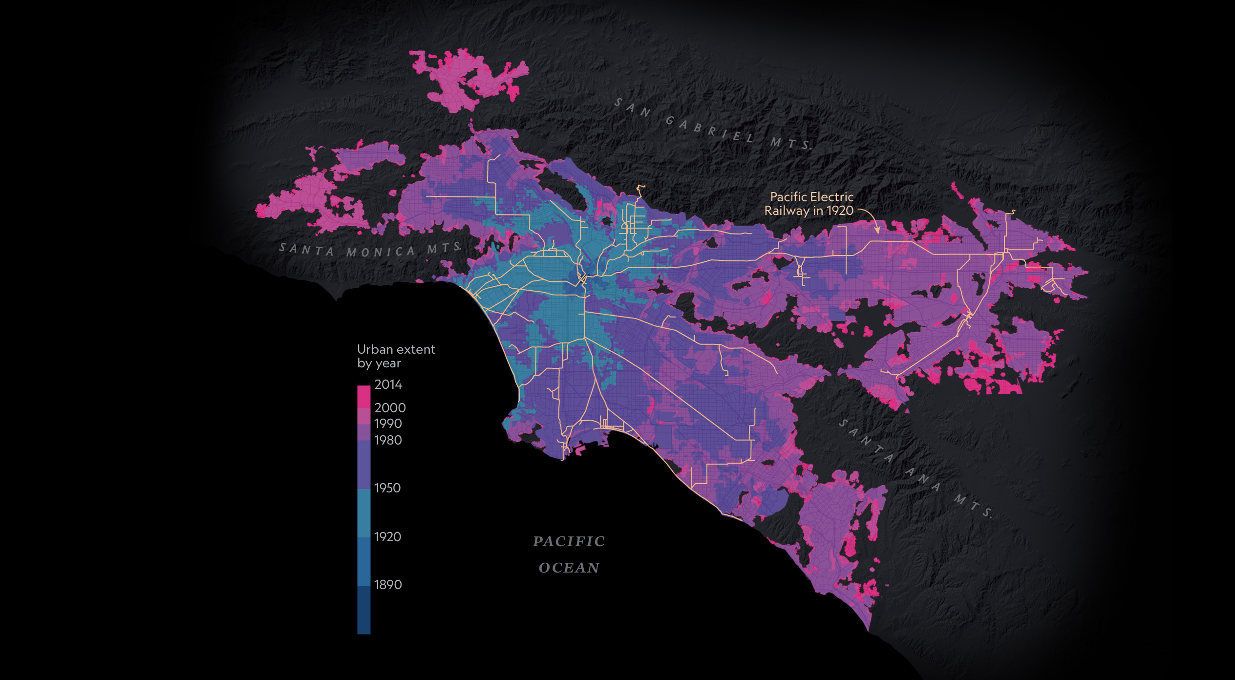
A TALE OF FIVE CITIES AND HOW THEY GREW
Rail, roads, and real estate play a role in the physical shape of cities. So does geography. To track how metropolitan regions have developed, Shlomo Angel and his colleagues at New York University used historical maps and satellite imagery to create the Atlas of Urban Expansion. The atlas defines city parameters to include the entire built area beyond a city’s jurisdictional boundaries and into surrounding municipalities.
These beautiful 4 maps of cities, three of them even with animation over time are nice to look at and show interesting patterns. The National Geographic has added some explanations to the graphs, and the dark theme works very well for the color scheme. Unfortunately, there is no information about the data sources they used.
Takeaway: Even wonderful and hand-crafted maps have room for explanations and a legend :)
A day of transit in Melbourne, Australia
![]()
Saw this one on LinkedIn and has no source or anything but it is beautiful to watch, and since I was recently in Melbourne I found it fascinating to look at.
I made a list in my last post about “What should be included in a map,” and this map is missing all of it.
Takeaway: At least include the source of your data on your map and a legend.
[Mayor’s Plan to Climate-Proof Lower Manhattan]()
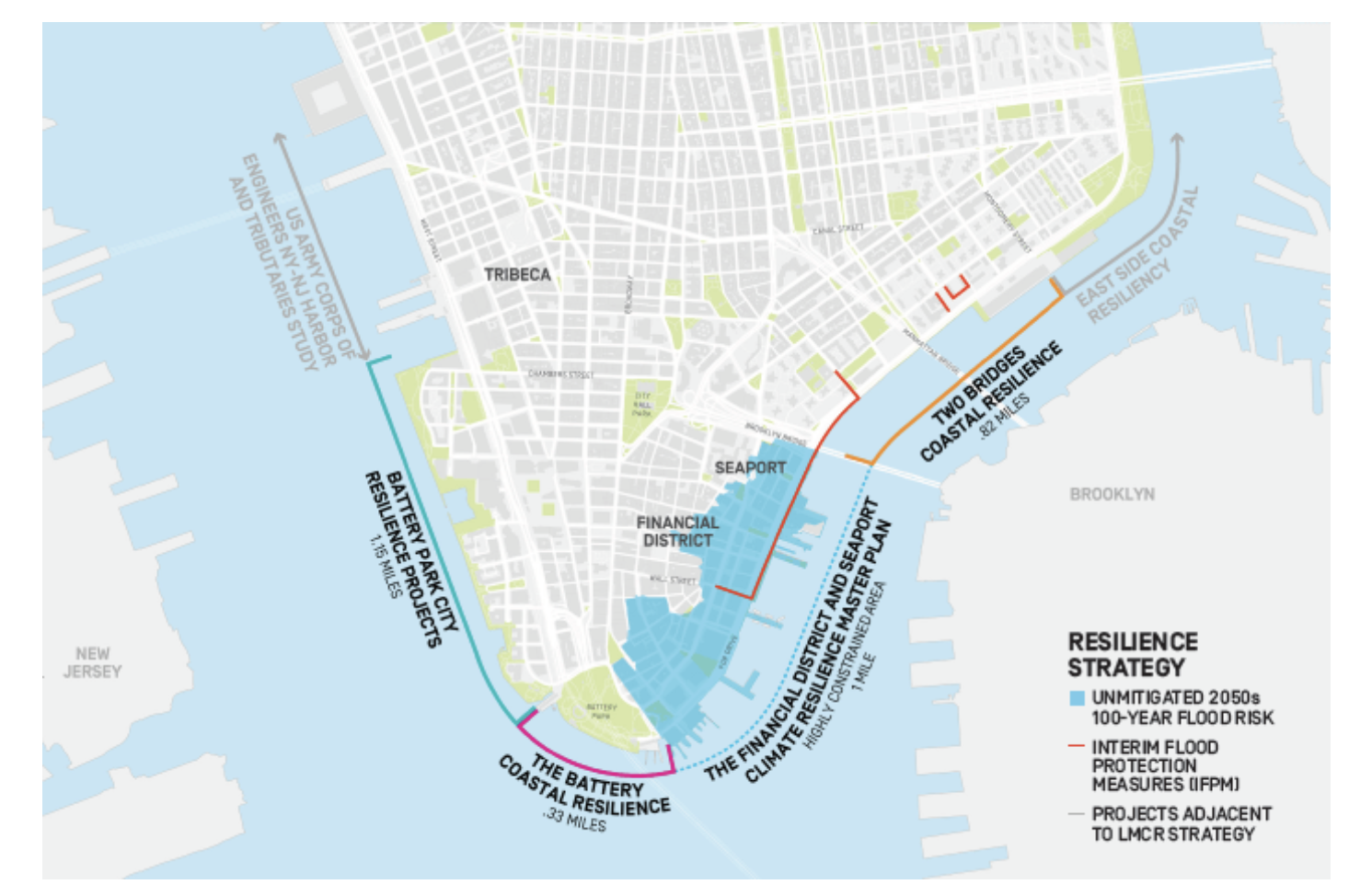
Under the mayor’s new $10 billion plan, the waterfront of the Financial District will be built up to 500 feet into the East River to protect against flooding.
This is a nice visually appealing map with great use of annotations. Some of them are harder to read and don’t offer too much information on their own, you have to read a text to know what’s going on with this map. I would have reduced the number of visible streets even further, they’re still distracting from the important data.
Takeaway: Too much supporting data can distract from your important data. Think about what needs to be included in a map and what might be a distraction.
Vacant property demolishions in Baltimore
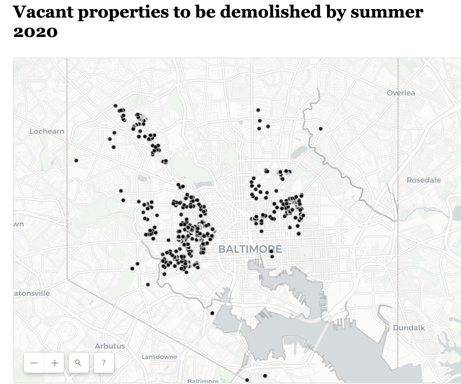
The number of vacant houses in Baltimore has remained at almost 17,000 for years but housing officials have pledged to tear down large numbers of vacant buildings by June 30, 2020.
I love that the Baltimore Sun is producing more data-driven content and sharing they’re experience and code with all of us. Keep up the excellent work.
I’m not sure how much value the point map adds here though. A heatmap or a hexmap would be more appropriate. It’s hard to see where significant clusters are. You can see it a little bit, but a different map type would have made the point more clearly. You would lose the interactivity but not sure it is necessary here. The map is embedded inside the story but is not referenced in the text.
Takeaway: Think about your map type choices. The default is often not the best choice. Think which type adds what kind of value to your data.
Hudson Yard

Hudson Yards Is Manhattan’s Biggest, Newest, Slickest Gated Community. Is This the Neighborhood New York Deserves?
Very nice scrollytelling architecture critique with 3D animations by the NYT. They zoom into each individual building and add explanations as shown above.
Takeaway: Scrollytelling is an excellent technique when done right.
Transit in Brooklyn
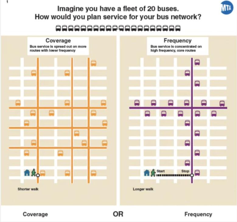
Interesting results from Bronx bus rider surveys conducted at MTA’s workshops for redesigning the bus network.
Civic Tech/Open Data
Why Californians need food assistance
Californians who receive food assistance come from all backgrounds, but many share a similar story: they were barely getting by financially when they were tipped into crisis by an unexpected expense or loss of income. This site shares their stories.
A well-done story about food assistance in California by Code for America.
From Open Data to Data Collaboratives: Panel Reflects on the Case for Data Stewardship
The GovLab hosted an official New York City Open Data Week panel on Monday, March 4th.
Three Takeaways from Open Data Day 2019
But perhaps the most important part of Open Data Day is not the technology. It’s not the data, it’s not the APIs—it’s the people.
Findings from the Africa Open Data Index and Africa Data Revolution Report
his regional version of our Global Open Data Index collected baseline data on open data publication in 30 African countries to provide input for the second Africa Data Revolution Report.
Articles
Civic Tech/Community
Open Government/Open Data
- Getting the Work Done: What Government Innovation Really Looks Like
- Predictive Policing Using AI Tested by Bay Area Cops
- New Mexico Legislators Want Crime Data-Sharing Network
- A Different Kind of Smart City Project Revs Up in Lima, Ohio
- How data collected from mobile phones can help electricity planning
- Utah to shut down its innovation incubator
- How open is your government? Find out.
- Eight years in, LAPD can’t measure PredPol’s effect on crime
Tweets
The Chicago Health Atlas with Kingsley from @ChiPublicHealth, Leslie from @CityTech_ and Katy from @ClarityPartners at #ChiHackNight.
— Raed Mansour (@reedmonseur) March 12, 2019
Check out where you can find over 170 health indicators for all 77 communities here:https://t.co/fy5jLe7e9b#publichealth #web30 pic.twitter.com/6m7jI4BGmf
We're teaming up w/@TomTomFest to spread #data best practices to more cities. #TomTomFest will give new cities that complete a WWC Certification assessment by 3/31 a ticket to its Civic Innovation Conference on 4/10. Get going on your assessment, here. ➡️ https://t.co/FVRcr4nqEx pic.twitter.com/uAFEQjv168
— What Works Cities (@WhatWorksCities) March 14, 2019