This week we have more articles than usual from newspapers using data-driven journalism. I really like that part of journalism and hope that more newspapers go that route. Especially the ones that publish their analysis so it can be reproduced or other newspapers can adapt it for their city.
Visualizations
Chicago Middle-class is shrinking.
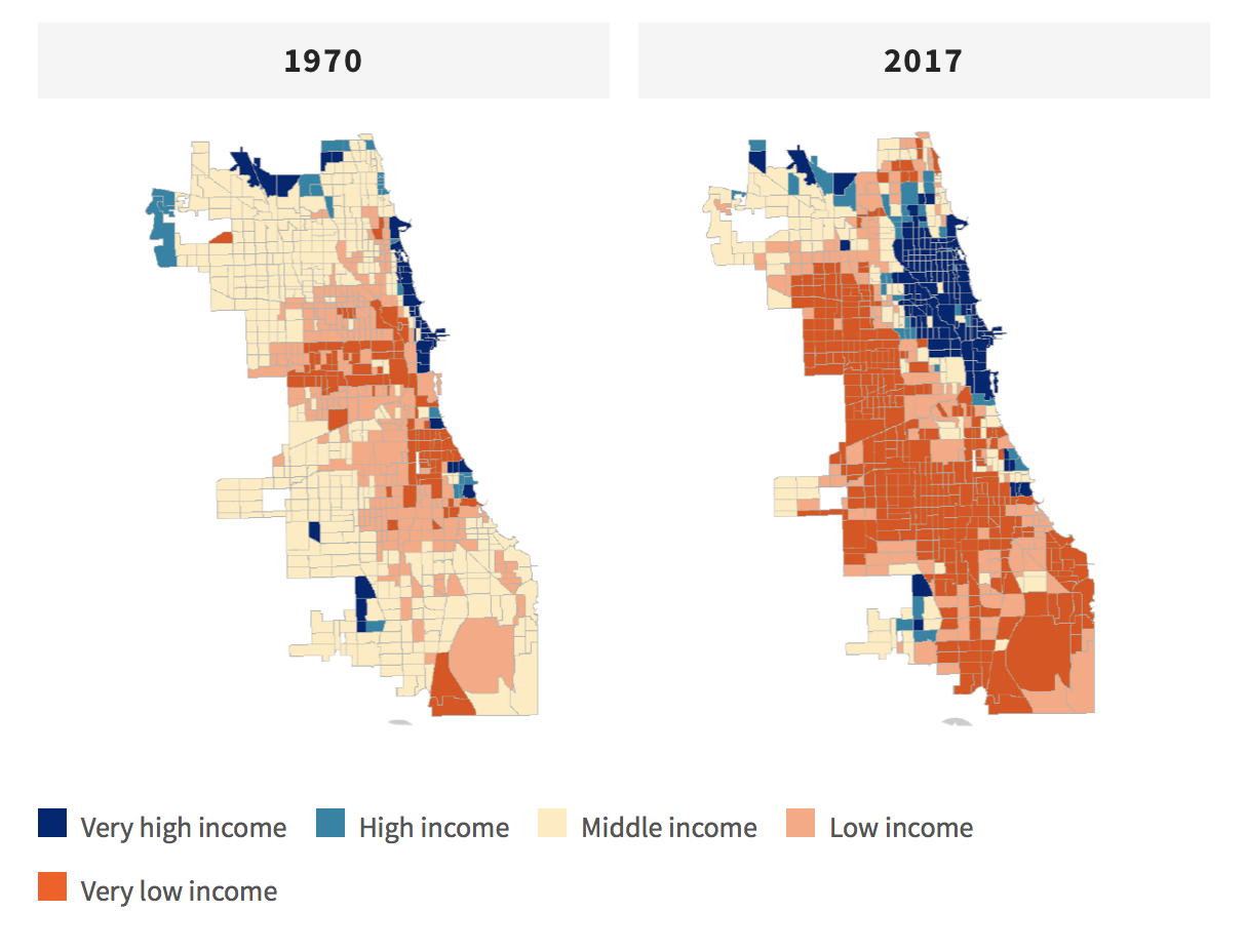
WBEZ Radio Chicago uses data and graphs from the Nathalie P. Voorhees Center for Neighborhood and Community Improvement at the University of Illinois at Chicago to produce an article with the title: “The Middle Class Is Shrinking Everywhere — In Chicago It’s Almost Gone”
What I liked about the whole article is that they have explanations baked into it. For example: what is the middle class?
I’m missing the methodology of the maps the center produced. The income levels are weighted income levels relative to seven country metro areas. But no explanation beyond that.
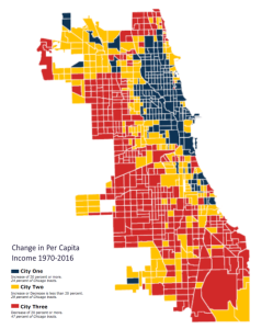
And if you look at the last map they produced it shows a different picture. 29% of tracts are considered City 2 (Income level increase or decrease of less than 20%).
Takeaway:
Methodology is an important part of your project for others to understand your visualization.
Honululu Dashboard
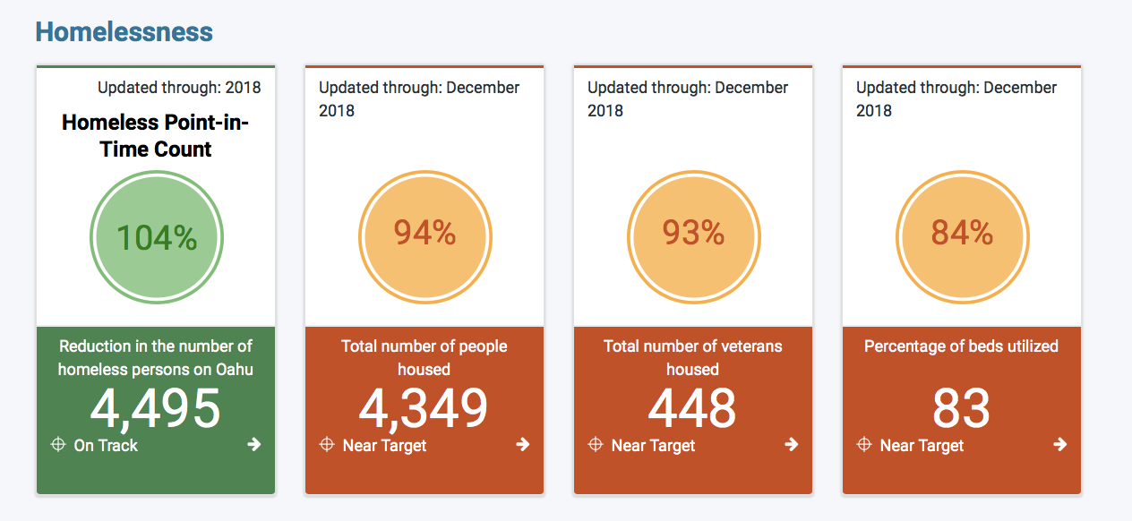
The Honolulu Dashboard monitors performance data in four priority areas: Homelessness, Affordable Housing, Streets and Lights, and Kākou for Parks.
Ultimately, Mayor Caldwell’s major priorities and other selected community interests will be tracked on Honolulu Dashboard. This site provides an “at-a-glance” view of these topic areas.
This is an excellent use of civic tech. A dashboard that lets you and the mayor look at key indicators and the performance of the city. It increases transparency and allows to measure the city on the issues the mayor itself prioritized. And I’m a fan of dashboards that increases transparency and only focusses on one number.
Takeway:
Dashboards should be clear, and one number is usually enough.
Low-Density Zoning Chicago
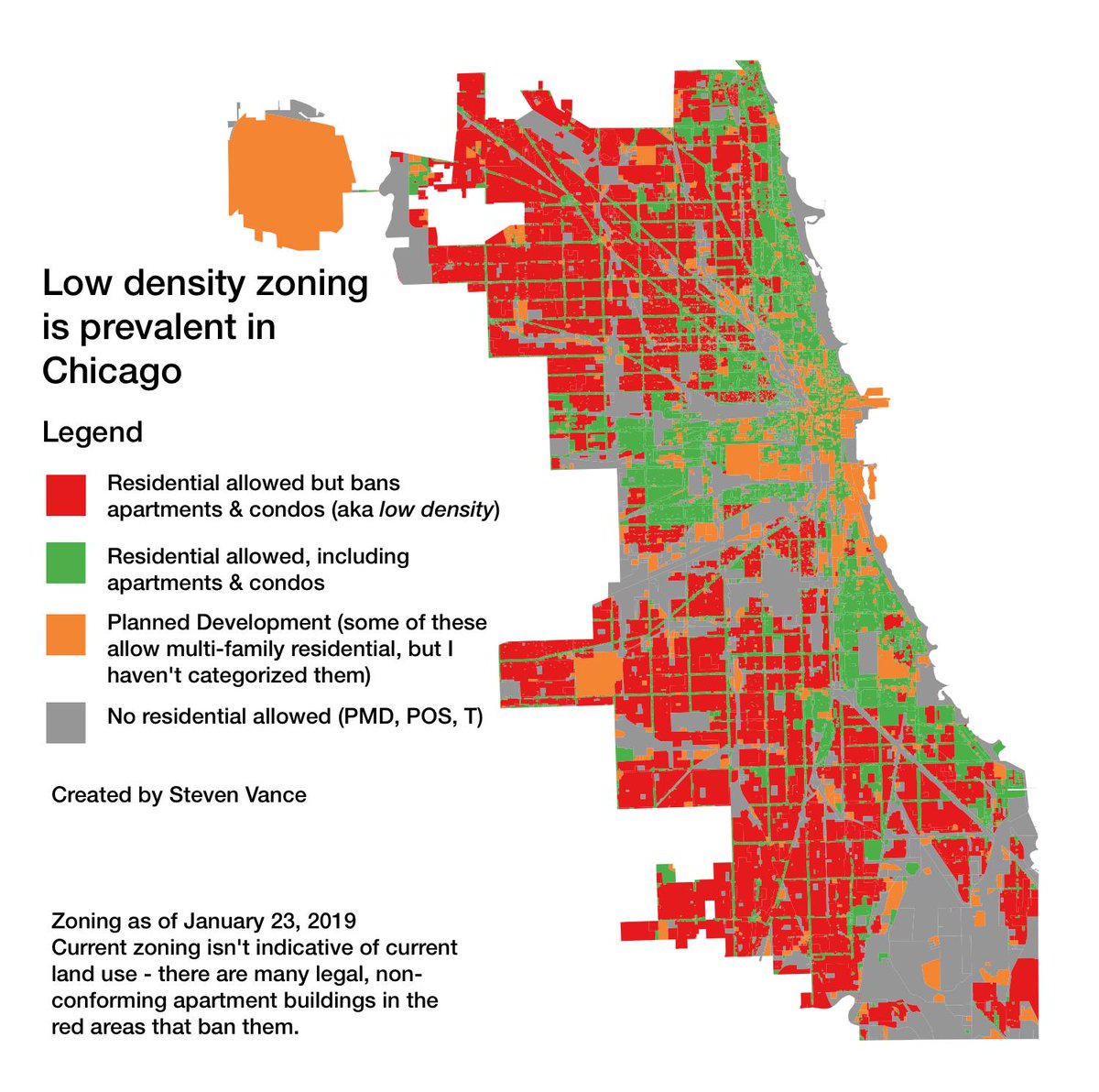
A map from Steven Vance who usually creates great maps for Chicago. This one is about density zoning. As you can see on the map most of the city is red (low-density zoning), and only a few parts of the city are green (aka allows condos and apartments).
This map paints a clear picture and probably show the authors opinion. The color choices, red for low density and green for high density indicates to me that the author likes to see more high-density zones. The legend is clearly marked and available. It’s only a picture, but I would have liked to state the data source. I assume it’s an open dataset from the city of Chicago.
Takeaway:
You can guide or even influence your audience with your color choices.
Homicides Baltimore
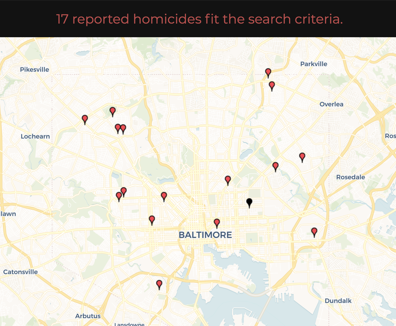
A Dashboard from the Baltimore Sun about homicides in Baltimore. And the corresponding Article. Too bad they did not include the map or the chart in the news article. There is potential to increase the effectiveness of the article.
Taking a closer look at the dashboard a few things come to mind that could be improved. The charts are a bit too cluttered. There is not enough emphasis on the crucial parts. By using color more sparingly, it would make it easier for the reader to grasp the meaning. The question that immediately pops into my mind, for whom is the dashboard for?
The cool thing about this is, they included the code for their analysis in a GitHub repository.
Takeaway:
Don’t clutter your charts too much, use color as a highlight mechanism.
Speed Limits & Fatal crashes in Germany
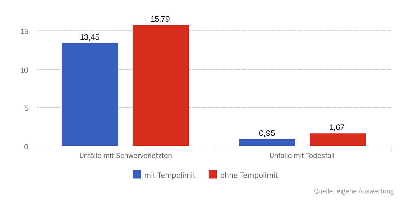
This is a visualization from an article of the German weekly newspaper “Der Spiegel”. It is about speed limits and the effect on crashes and fatalities. The blue are the ones with speed limit the red bars are without speed limit. On the left crashes with severe injuries and on the right with a fatality. The numbers are crashes for every billion miles. So 13.45 crashes with severe injuries for every billion miles driven.
I like that they published their results and clearly state the source of their analysis and compare it with other sources. It’s an R notebook so you can import it and run it yourself. But they could have used color more precise. The headline is: 140 deaths could be prevented with speed limits. That’s why I would emphasize the bar without speed limits.
Takeaway: Use color sparingly and highlight the bars you want your readers to focus on.
Environmental Hotspots in the Bay Area
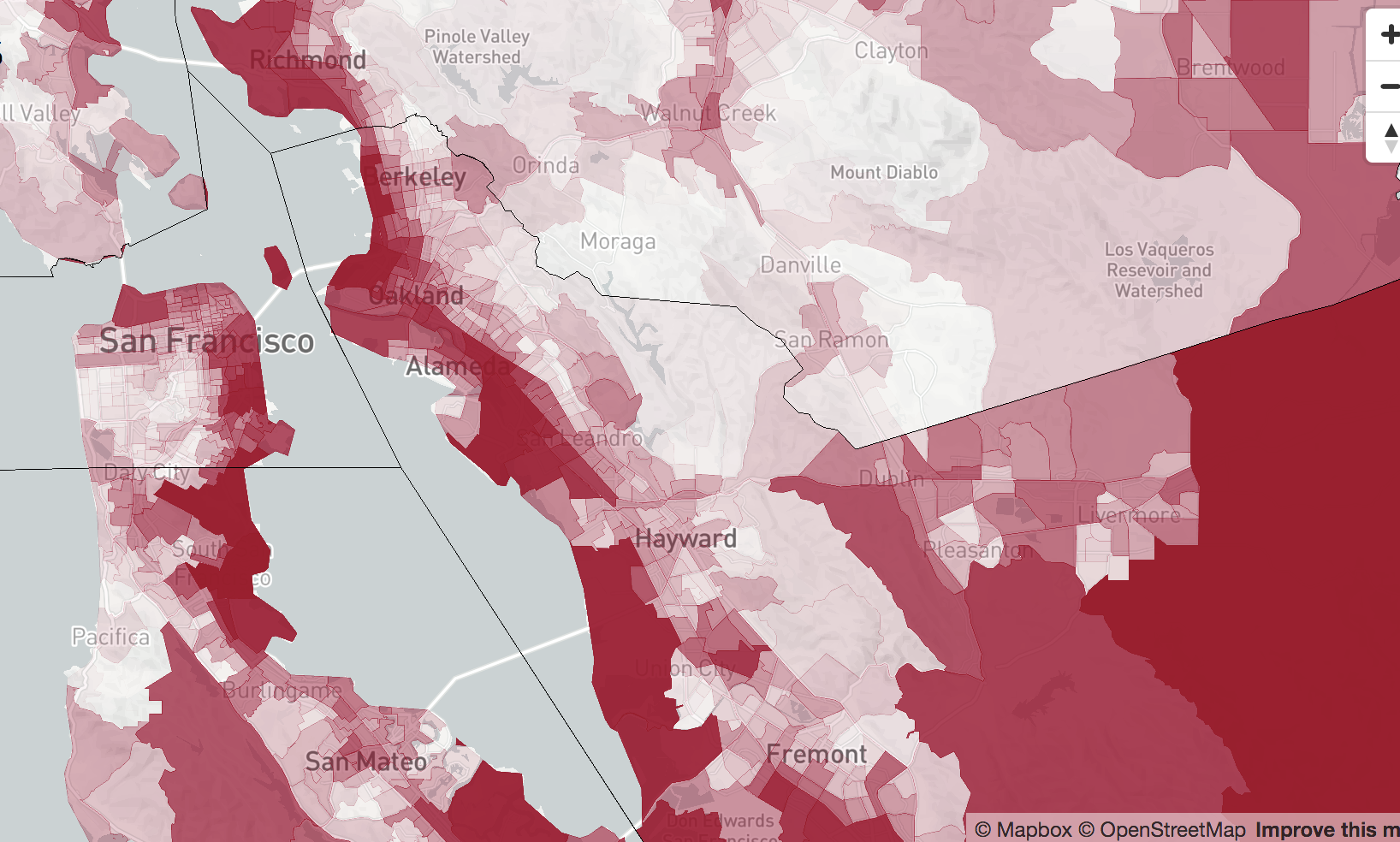
A student project from the University of Berkeley Journalism school for a course called “Introduction to Data Visualization”.
Using data and indicators aggregated by the California Office of Environmental Health Hazard Assessment (OEHHA), the map above and the charts below explore where environmental conditions are the worst (and best) in the Bay Area and how class and race relate to those conditions. This first set of charts shows the relationship between poverty and pollution.
It is an excellent start for a journalism student; that’s why I included it in my roundup. It is a very interesting dataset, and the source should have been included on the site.
I would assume that the red areas have bad environmental conditions but no way to know. The legend is clearly missing, and it is not very obvious what the areas represent. Are these census tracts? Or measurement points, are the values aggregated for the area. A lot of questions to be answered. But a nice first take for a student project. Keep up the good work.
Takeway:
Always include your legend that people can understand your color choices and scale.
Response Outreach Area Mapper
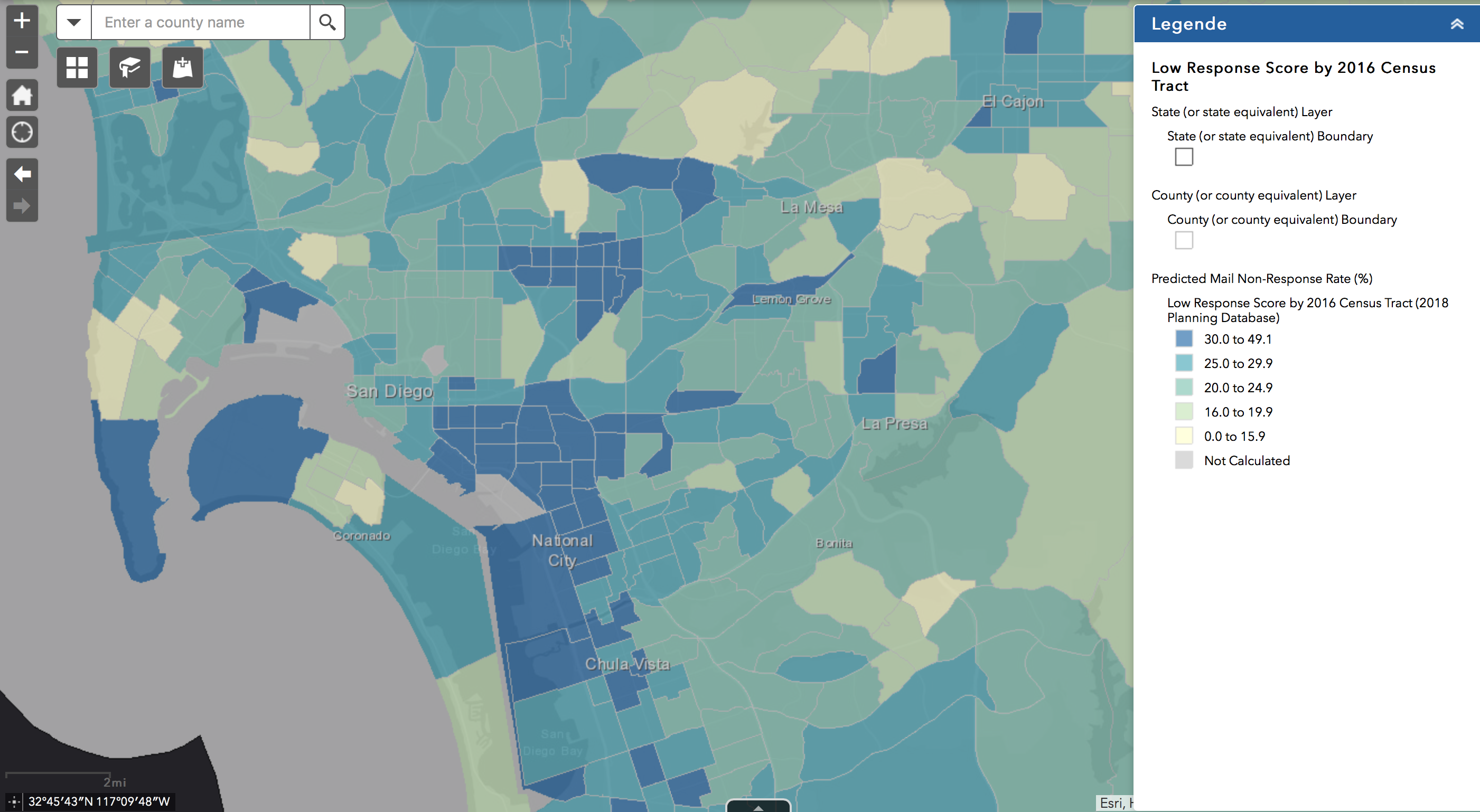
The Census Bureau has released an online tool called ROAM (Response Outreach Area Mapper), an application that uses American Community Survey data to measure how hard-to-count each census tract might be, assigning each a score. Now cities and states are building on top of that base with local insight.
Open Data
[New tool for city leaders and urban planners to ‘get ready for data’]()
With huge amounts of data available – and increasingly sophisticated techniques for data collection and analysis – it can be hard to know where to start when you’re planning the data strategy for a new policy initiative.
Consultations on Ontario’s Data Strategy are out. Have your say before March 7:
http://ontario.ca/DataStrategy.
Virginia Beach is fueling its future with open data. Here’s how
The Open Performance Site is a portal that was created to provide quick and easy ways to access the performance of the community and the city, officials said.
This is similar to the first entry in the visualization section about Honolulu’s dashboard. But this one is not as visual as the one above.
A new data portal for the City of Kingston: From increasing transparency to engaging citizens
Earlier this year the City of Kingston (Canada) launched a new data portal and we organized an interview with Scott Tulk, Technology Solutions Architect in Information Systems and Technology, to learn more about this local data initiative.
Articles
Civic Tech/Community
Open Government/Open Data
- Nassau County, N.Y., Opens Up Finances Amid Corruption Scandal
- Gridics Announces 3D Zoning Map and Text Tool CodeHUB
- California Water District Opens Spigots for Tech Upgrade
- Meeting the Workforce Challenge: Strategies from Kansas City and Massachusetts
- Device-as-a-Service Opens the Door to IT Efficiency (Contributed)
- CityGrows Permit Platform Bets on Do-It-Yourself Simplicity
- Finding the Magic Line Below Which Cities Can Buy Stuff Easily
- Boston Increases Size of Popular Digital Equity Fund
Tweets
I've thrown together an API for disseminating info on statewide, federal, and General Assembly candidates in Virginia. There's a readme available detailing routes and data on GitHub - https://t.co/wtOV1YBtEy #civictech
— Chris Frashure (@frashure) February 17, 2019
Did you know that #NYC has more than 2000 free #opendata #data assets? Learn more March 1-9 during Open Data Week 2019: https://t.co/ZYybdVeTH6 #datascience #tech #dev #bigdata
— Datapolitan (@Datapolitan) February 22, 2019
Urban, social data helps reduce fire and safety risk https://t.co/Jl7nsSP4Yg #govtech #publicsafety #data @MetroLabNetwork @Ben__Levine @Portland_State @PDXFire pic.twitter.com/IEcYu58SOC
— Govtech.com (@govtechnews) February 19, 2019
New mapping software creates digital atlas of street signs https://t.co/XiMERzY1sT #futurestructure #govtech @mapillary @janineyoong pic.twitter.com/0pXJ3tgqKi
— Govtech.com (@govtechnews) February 20, 2019
If Taxi Trips were Fireflies: 1.3 Billion NYC Taxi Trips Plotted. https://t.co/7qk2TaYJfA#dataviz pic.twitter.com/5XdKPgPlc4
— SexyData (@sexy__data) February 23, 2019
Lessons from our open data work in #Madison:
— Sunlight Open Cities (@SunlightCities) February 18, 2019
👉🏼 Tailor #opendata work to meet community needs
👉🏼 #Cities should actively engage residents to make use of data tools
👉🏼 Seek out community feedback for more impactful work
Read the full #blogpost here: https://t.co/9WZ8C4gpSm
When #civictech works well, it looks like this: simple changes = big impact. Prioritizing people's actual needs (based on data), making those functions easy to find. Saves money, too! #winning https://t.co/HIfRxXP6Ph
— Monica Childers (@mcranechilders) February 19, 2019
Help build a sustainable Buffalo and you could win the Grand prize of $7,000! Join @OpenDataBuffalo @MobilizeNY @recyclebuffalo @Esri on Saturday, 3/9/19 for @MayorByronBrown's Civic Innovation Jam: https://t.co/qiIUIVnhmR #Buffalo #buffaloinnovates #civictech #innovation pic.twitter.com/AD0kJjlVL6
— Open Data Buffalo (@OpenDataBuffalo) February 22, 2019
3 Principles to Guide Every Civic Technology Project https://t.co/o6iR2TERwg #civictech
— Engaging Cities (@EngagingCities) February 7, 2019
Jobs
Upcoming Events
- Open Data Day around the world: March 2nd.