This week is heavy on visualisations and maps again. Lot’s of interesting things were released last week.
Visualizations
Fighting Opioid Misuse by Monitoring Community Health
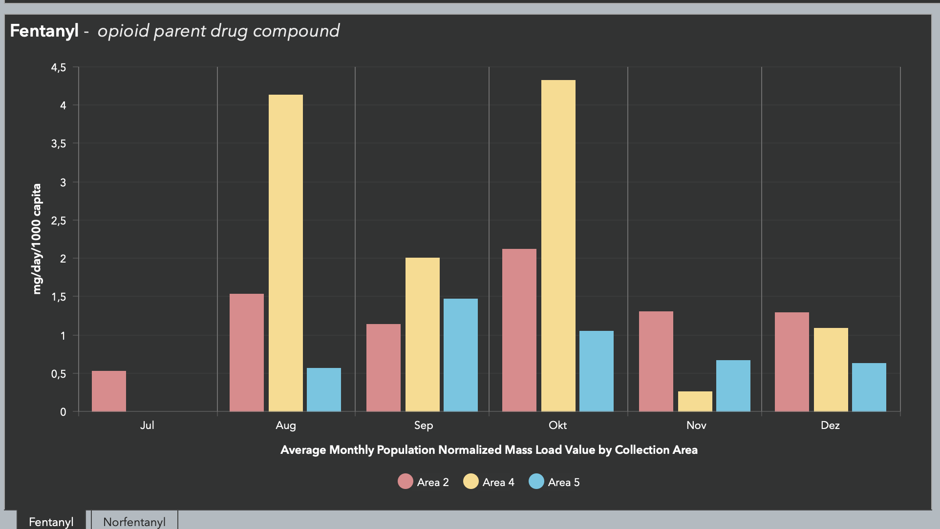
This is a cool project by the City of Tempe, AZ using ArcGIS storymap and dashboard to explain opioids in wastewater collection.
If you only look at the dashboard, it is not immediately obvious why only three areas have graphs, and three don‘t. But if you read the story map, it will be explained. My question with dashboards always is: Who is the audience. Is it the general public and is the dashboard to be used as a standalone project? Then a lot of explanations are missing.
If it is for city workers and only shared for the sake of sharing and showing transparency, I would argue that a dedicated dashboard for the public would be in order.
Takeaway: Always ask yourself who is the audience of my visualization.
San Diego Launches ‘Sim City’ Planning Tool For Clairemont
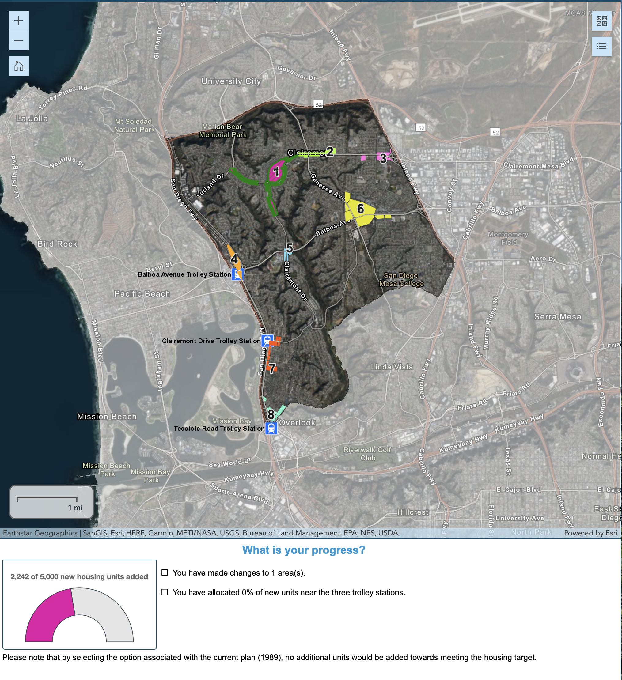
The City of San Diego launched a new tool to invite the community to help update the Clairemont Community Plan. It encourages residents to provide input for additional housing. The goal is to add 5,000 new housing units above the current plan.
In an ongoing effort to provide innovative approaches to improving the quality of life for residents and businesses, the City of San Diego’s Planning Department has developed a new online community engagement tool. This tool will allow the community to engage in the planning process from any computer or mobile device 24 hours a day, this solves many of the traditional challenges associated with attending an in-person workshop.
What I like about this tool is that the map only focusses on the area of interest and greyed out the rest of the city. I’m not sure why satellite imagery is necessary. I would argue a lighter street background would be valuable as well. Once you zoom into the specific areas, the satellite map makes sense and provides additional context of what is already visible. But you could have used a map that is easier to navigate on higher zoom levels.
The color choices are also interesting. :)
Takeaway:
Every zoom level does not need the same basemap. You can switch the basemap depending on the context of the application.
People’s Perception Of Crime Rates Vs. Actual Crime Rates, Visualized
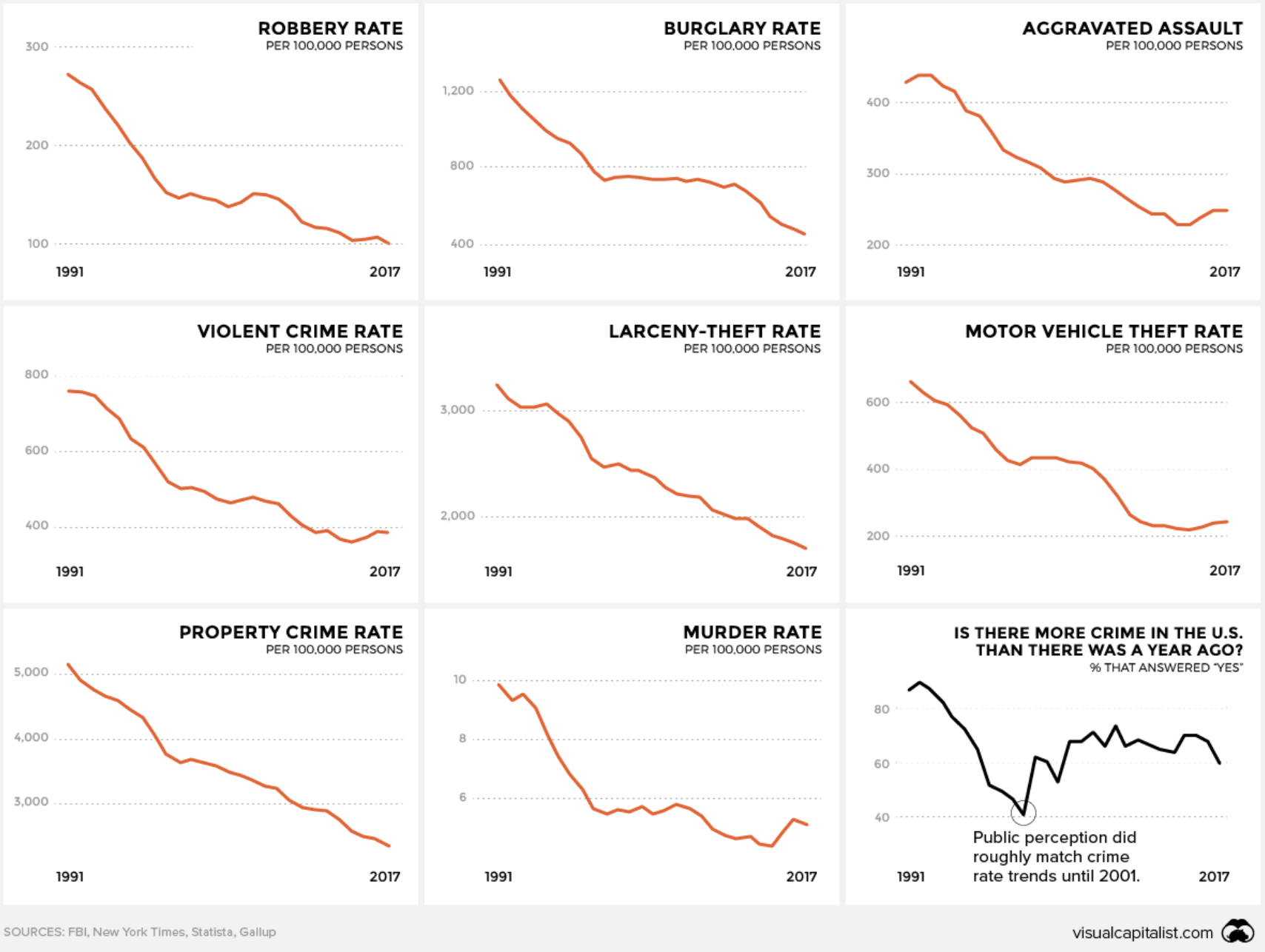
Excellent use of small multiples but as the source on Digg added:
It’s worth noting that these graphs, while persuasive, are slightly misleading, since the y-axes don’t start at 0 and use different scales. In other words, all of the crimes named above have decreased significantly in prevalence since 1991… but they haven’t all decreased the same amount, as the visualization seems to imply.
I would not go that far that all scales should start at zero but at least the percentage between the min and max on the y-scale should have been the same. You could at least see the rate of drops.
And the last chart about the perception is not very clear, I get why they choose it, but it takes some time to get your head around it.
I would have used slope graphs with three dates 1990 - 2001 - 2017 since 2001 was the year the perception of the public changed, and you should see that clearly in a slope chart
Takeaway:
Using the right scale is essential.
ActNow After School programs
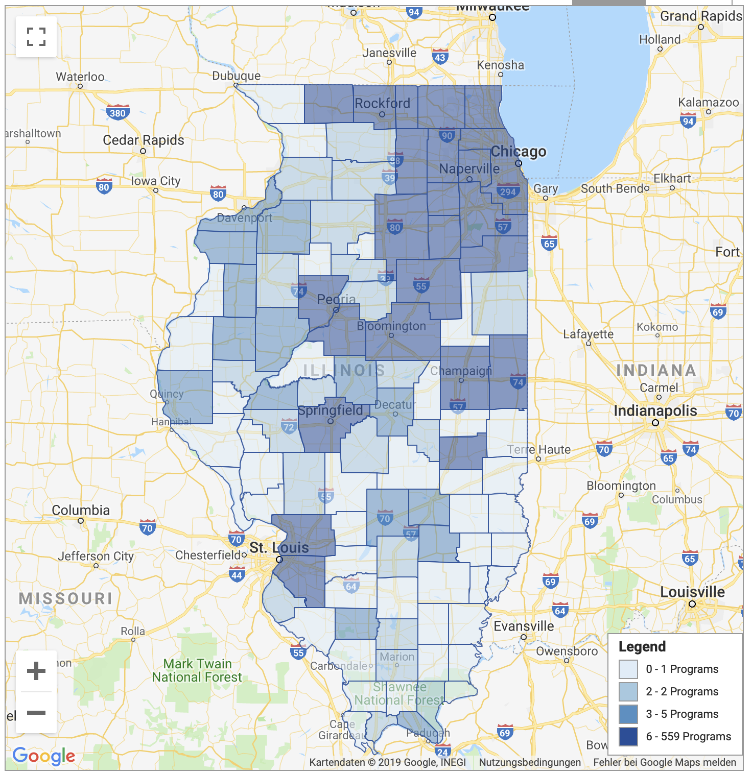
A map about after-school programs in the state of Illinois.
I like that they included a legend and a “How do I use this map” to help users with the interpretation.
The basemap makes it hard to read the data correctly. I would change it, and Google has a nice grey scheme basemap which could be used.
Also, I would be interested in hearing why they let the user select multiple geographies or if they are using it internally to asses their success?
Overall I’m not sure how much more value a map adds to the data, to be honest. If you dive deeper into the data, you see actual locations which might add value, but the choropleth map could have been a list with dots as indicators.
Takeaway:
Before you make a map, think about if the spatial components add value.
The Early Childhood Workforce Index 2018
Nice visual representation of the workforce index. Nice looking colors and explanations.
Just as the previous map as well I would argue that the map does not add value. You could easily have a list of the states. People usually know where the states are and don’t need a reminder where they are located. If you want to make an argument that a specific region is performing worse and you use this map to make it more obvious than a map adds value.
Takeaway:
Before you make a map, think about if the spatial components add value.
Source: University of Berkeley
New Census Data: Record Illinois Population Loss For The Year, 5th Straight Annual Loss

These charts would make Cole Nusbaumer very happy.
The use of colors in all but one chart is very good and focuses the reader on the one bar that is important to the story: Illinois.
I would have made the other color not back but a darker grey.
Takeaway:
Use color sparingly and only to focus the reader on the things you want to highlight. It makes it easier for the reader.
Think about what if all charts had either the same color or all different colors. It would be harder to find Illinois and then compare and always need to find it again.
Snow days in Germany
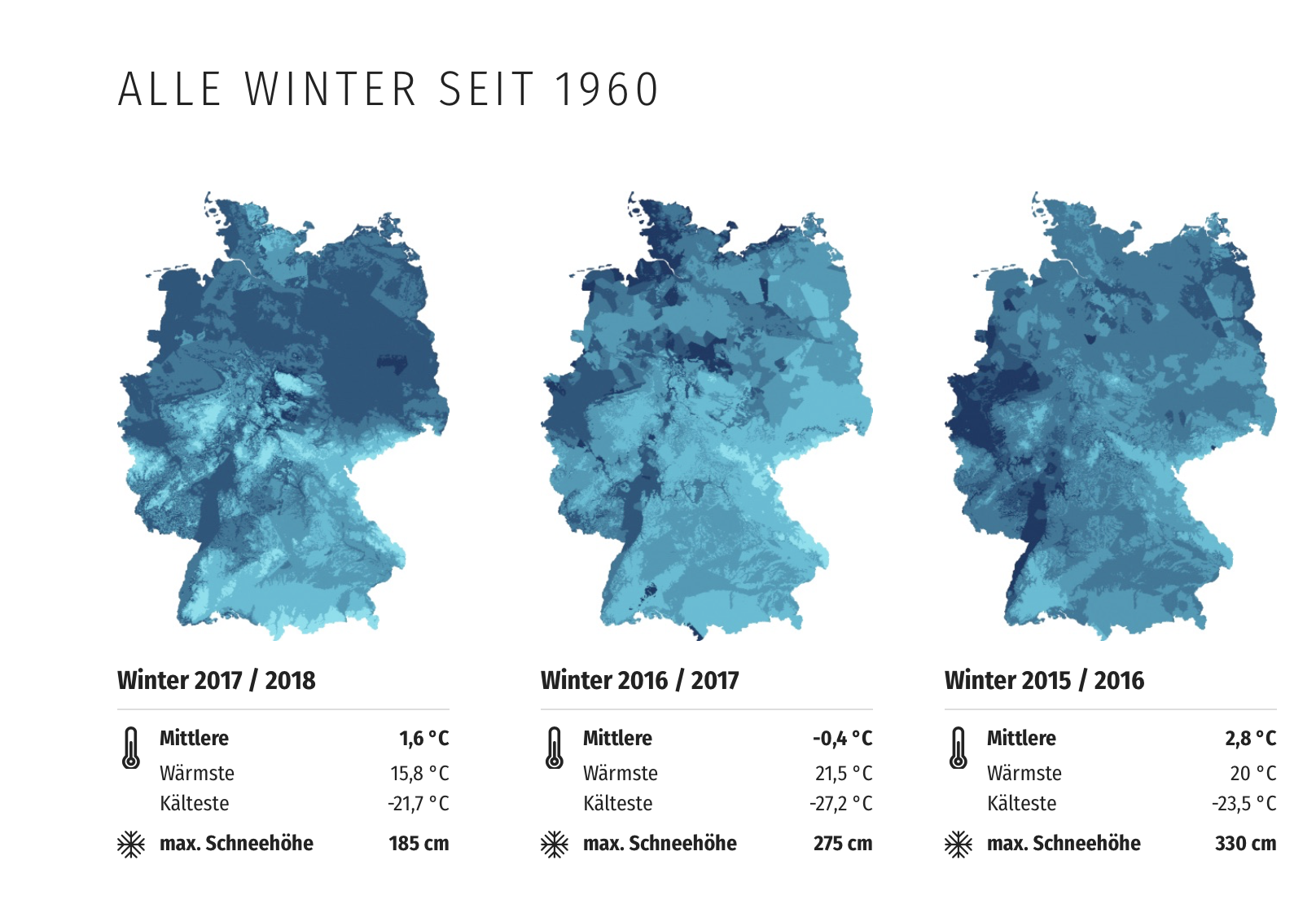
Nice visualization of winter in Germany for the last 60 years from am german newspaper.
Nice use of small multiples and color scheme. But I am not sure about the color usage. Darker hues usually refer to more, and in this visualization it‘s used for the opposite. I asked them about their choice but have not heard back yet.
Interesting viz and nice small multiples. I’m curious why you choose a darker color for fewer snow days and a lighter color for more snow days? I would assume the opposite. Darker usually refers to more.
— Mila Frerichs (@milafrerichs) February 15, 2019
My guess is that you wanted to show snow (as white)?
Takeaway:
Color scales and their hues matter. Think about what people are used to already and decide if you want to go against the norm. There are good reasons why you might want to do it but try to avoid it.
Infographic: Transit and Emerging Technologies
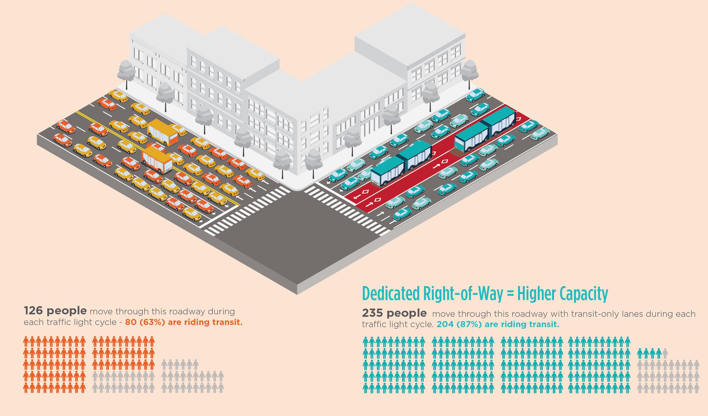
Source: Nelson Nygaard Consulting Associates
Uber Opens Travel Time Data to the Public
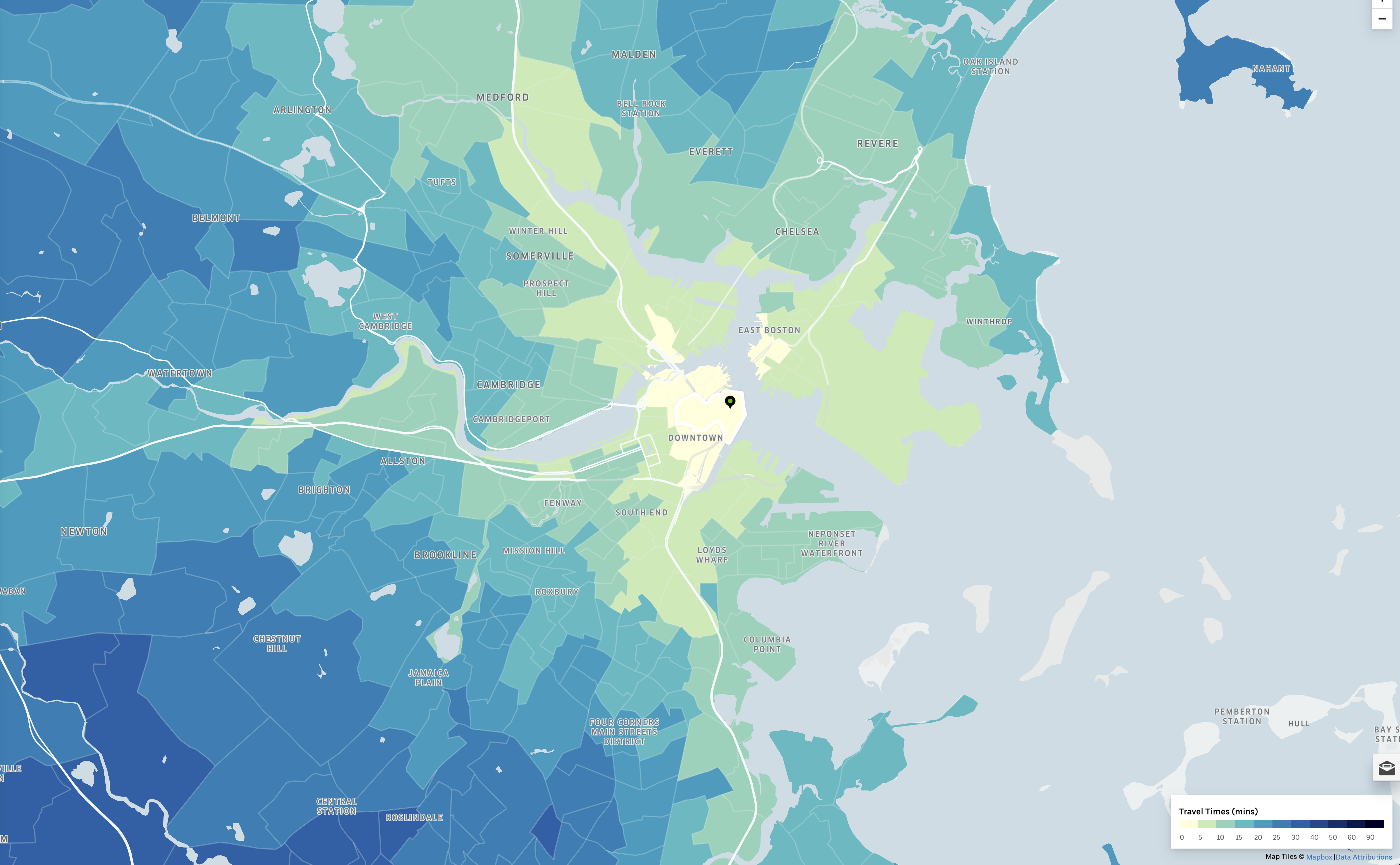
Starting today, Uber has announced that they have opened access to their travel times data to the public (for selected cities, including Melbourne and Sydney). Previously, Uber required users to sign in before they could explore and download Movement data. By making travel times data more accessible to the public, Uber hopes to see more research and insights that will help shape the cities of the future.
Open Data
Toronto Fire Services releases high-rise violations inspections data – with notable holes
Toronto Fire Services released the results of “fire prevention inspections” of high-rise residential buildings in 2017 on the city’s website on late Tuesday afternoon.
I wanted to make a visualization out of it, but did not find the time yet. The data is not immediately visible and Open Data but I found the underlying data:
Data Link
Hopefully later this week I can update this post and maybe share a more detailed one how I used the data.
Since Parkland
A very sad but important dataset, released by McClatchy, the Miami Herald and The Trace.
The organizations pulled information on gun-involved deaths of school-age children from the nonprofit research group Gun Violence Archive, which culls reports of gun-involved incidents from more than 2,000 media sources. To compare deaths in the year since Parkland to those before, McClatchy classified each year as starting on Feb. 14 and ending on Feb. 13.
New San Diego County Crime Data
The San Diego Regional Library updated their crime data collection with files for 2016 and 2017. Their crime data collection now runs from 2006 to 201.
Data Common
MAPC’s DataCommon has hundreds of downloadable datasets specific to Mass. and our region - with many broken down by municipality.
Missed last week: Illegal parking reporting NYC
New analyses of 311 "Illegal Parking" reports are up! Do you want to know _exactly_ how well your local officials actually respond to 311 reports of street safety problems? This is the thread for you! Open data is the best data. #placardcorruption #bikenyc
— Jake Schmidt 🥑 (@TheJakeSchmidt) January 31, 2019
Articles
Civic Tech/Community
Open Government/Open Data
- Device-as-a-Service Opens the Door to IT Efficiency (Contributed)
- How Miami's Innovation Academy Promotes Digital Literacy Programs
- Could California’s Data Privacy Law Be a Model for the Nation?
- Cloud Emergency Dispatch Startup RapidDeploy Raises $12M
- The state of open government (data) remains divided, at risk, and underfunded
Tools
Dedupe
Dedupe got a design refresh and an explainer video.
Tweets
Have you seen the 311 Insights page on @CityLittleRock Open Data site? https://t.co/9AghFcfHs4 pic.twitter.com/HFrx8TOOg3
— LROpenData (@LROpenData) February 15, 2019
The gap between private and public sector technology is growing and users are noticing. Everyone wants to do things as quickly and conveniently as possible but many #govtech organizations aren’t meeting the demand. Find out more: https://t.co/Rdr10v8O5L #civictech #govtech
— InFlight Corporation (@inflightcorp) February 12, 2019
Super cool #civictech coming out of NY taking the biggest societal issues and innovating + using data analytics: https://t.co/YnuYAjtDSL
— Natalie Meyers (@NatKMeyers) February 11, 2019
I wish grantmakers would fund #technology and #data within charities. Not as part of a specific project funding where tech is a component , but as a project for itself. Where core funding is scarce, helping charities to catch up with tech can will create a better sector.
— Mor Rubinstein (@Morchickit) February 11, 2019
Works Progress Administration streets remaining in Chicago (aka streets with no curbs) https://t.co/em3L1a4LY0
— Mike Bingaman (@bingaman) February 2, 2019
Looking to learn about a new model of a Civic User Testing group? Read about how GRIT Toronto is gathering residents to improve technology: https://t.co/Ss5vIUls5Z #civictech
— Open Charlotte Brigade (@OpenCLTBrigade) February 12, 2019
Happy to see this opinion piece showcasing the amazing work of #civictech non-profits and the call for more socially driven incubators + accelerators to get more projects off the ground https://t.co/VJgTIrOFWn
— Lauren Rennée 🚠 (@lbrennee) February 12, 2019
What if you could tell which specific outreach efforts were generating the most participation?
— PublicInput.com (@Public_Input) February 8, 2019
Now you can:https://t.co/smUJE45lPt#GovTech #CivicTech #SmartCities #LocalGov pic.twitter.com/bnjNKN2CWf
In 3 weeks, we're holding our first quarterly #labbyhour, come hang out after work on March 5th and talk #civictech, web maps, dataviz, and #opensource with your favorite NYC digital team!https://t.co/Gsr2HZ0k6I
— NYC Planning Labs (@nycplanninglabs) February 12, 2019
Do you have an idea or early-stage venture in #HealthTech #Sustainability #EdTech, #CivicTech, tech to support #YoungPeople or #WorkerTech?
— BGV (@bg_ventures) February 12, 2019
Then apply now to our upcoming programme to receive funding and support! https://t.co/ibfk2oex2I
#civictech wish of the day:
— Luke Fretwell (@lukefretwell) February 12, 2019
Would love to see more folks (especially leadership) from @CADeptTech actively engaged in @CodeCAgov.https://t.co/IdQMm0VxSY
Looking for opportunities to volunteer your #tech skills in #scipol and #advocacy? We spoke to @DemocracyLab to learn more about their platform to connect technologists with opportunities: https://t.co/4g66ikaGvv #scicomm #ESEP #civictech @ESEPCoalition @SciNetUCS @codeForPDX pic.twitter.com/gvIvqnEu5w
— Eng&SciActLocally (@ESAL_us) February 11, 2019