This week is a short one. A lot of tweets though :)
Visualizations
London Arts Map
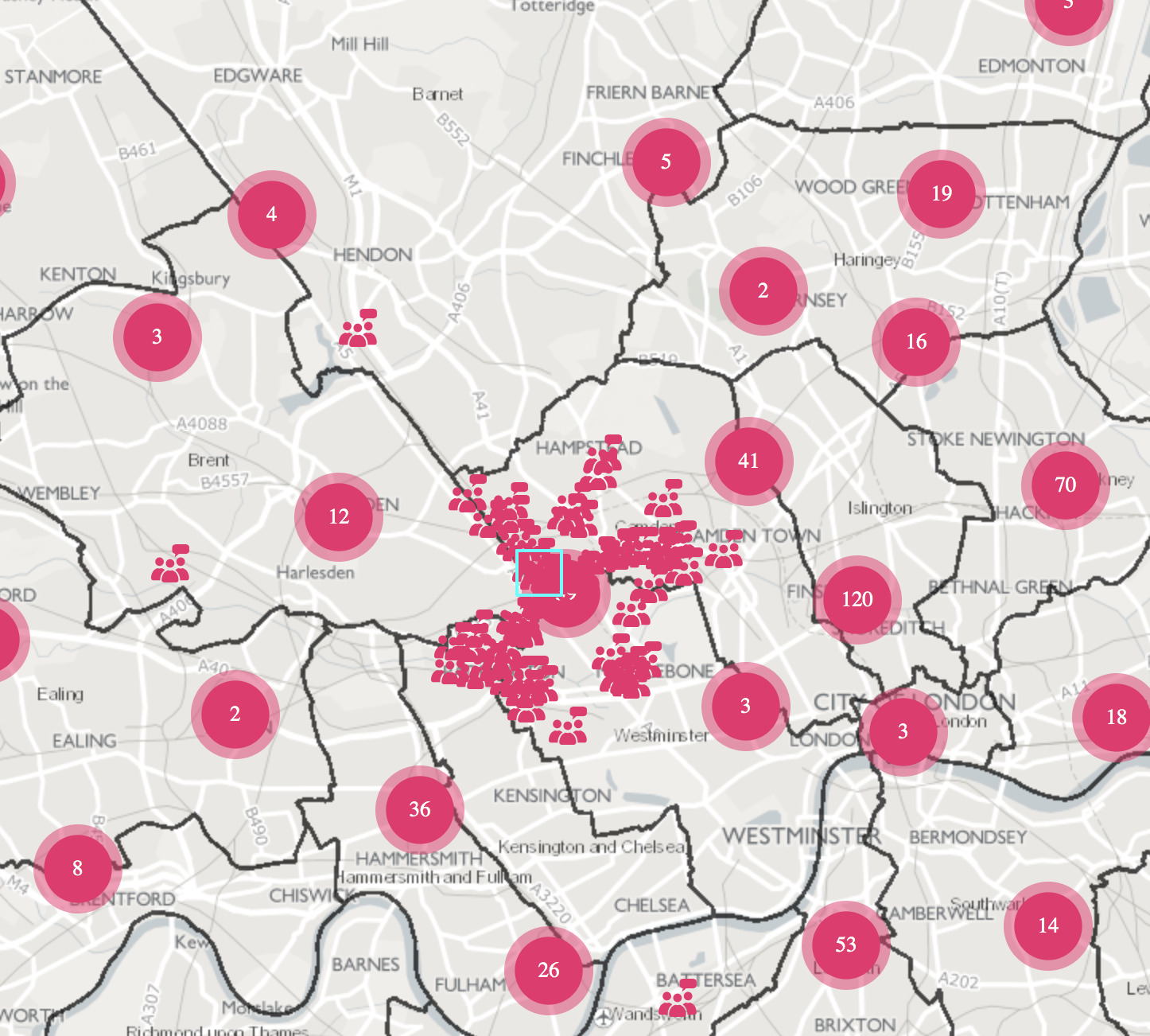
The collated data on the capital’s cultural locations is hoped to support local authorities, property developers and associations develop existing clusters and build creative infrastructure
This map is a great start and typically for these kind of maps, where you throw a lot of data at the user. The clusters are a good way to convey the right amount of information. But once you click further these symbols appear and make it really hard to see and read the map.
Takeway: Be careful when to use symbols. Especially if you have a lot of data to show.
Mega Cities
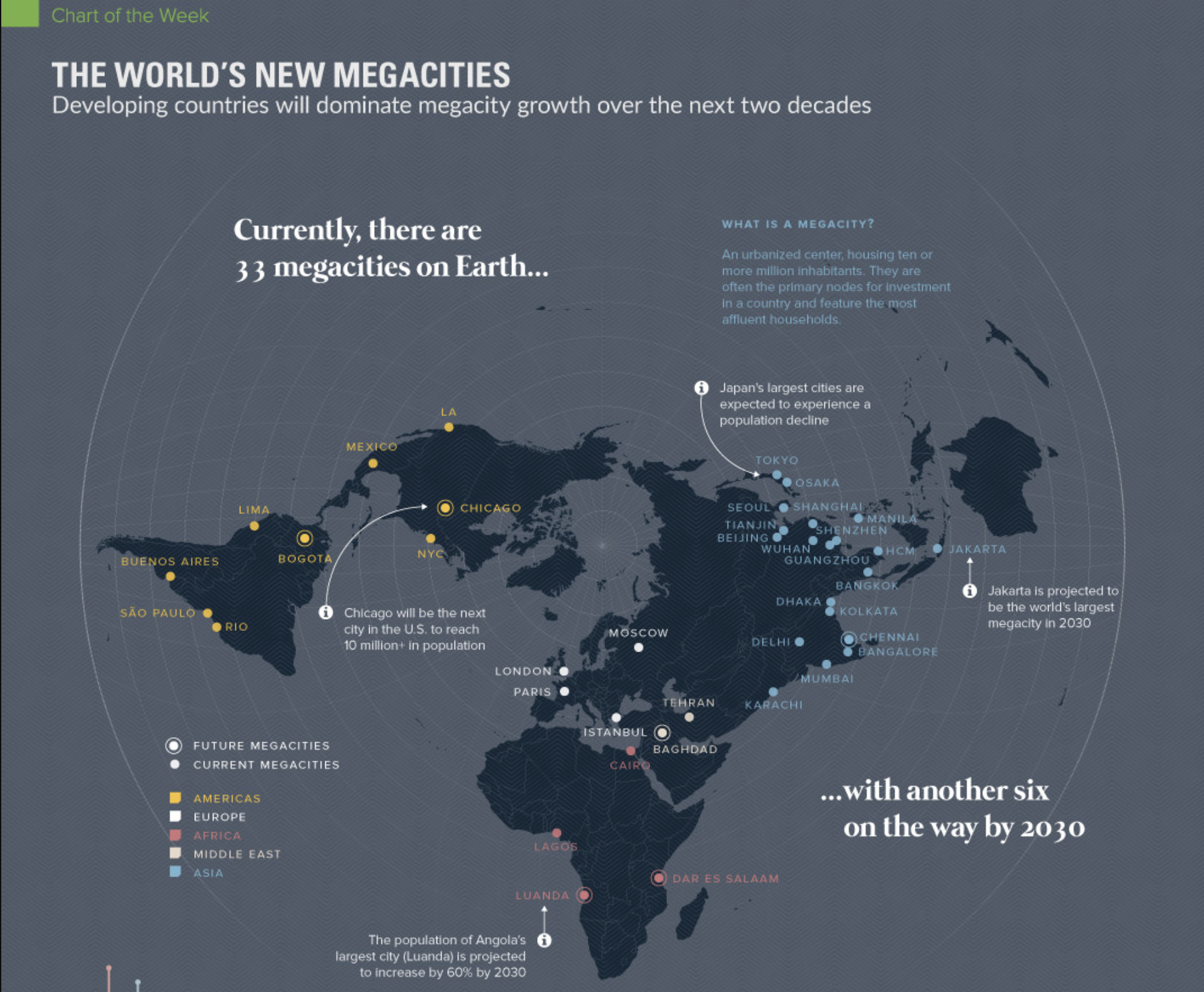
This is a great looking map with an interesting projection that serves the data well.
Takeaway:
Map Projections can help you display data differently and make data more readable.
County profiles
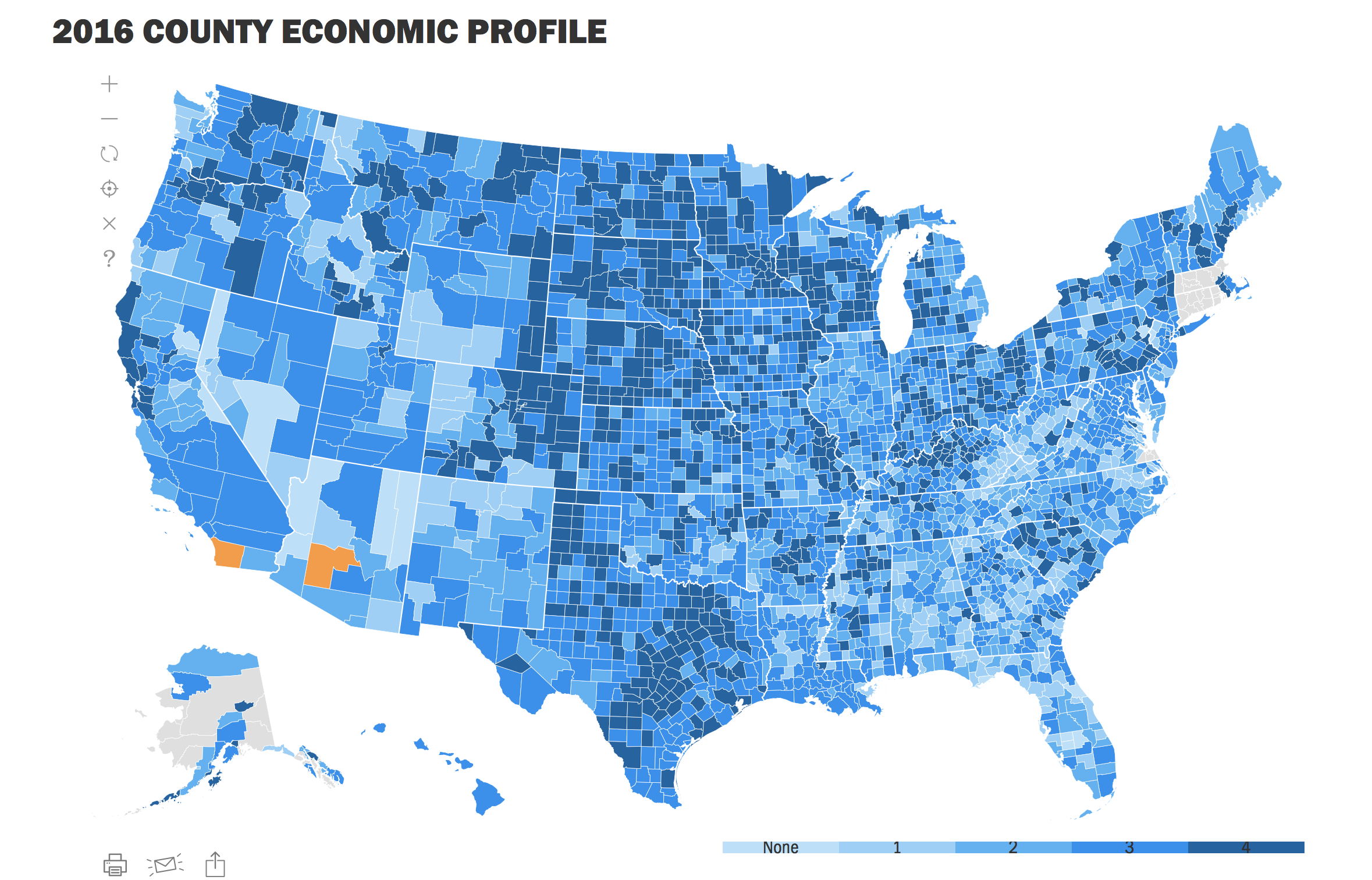
Takeaway:
Sometimes your visualization needs more explanations. Make sure to include them.
Civic Tech/Open Data
Civic Tech Guide
Your guide to tech for public good. By @mstem, @mlsif, and people like you. A crowdsourced, global collection of civic tech tools and projects since 1994.
If you haven’t seen it in the last weeks check out the Civic Tech Guide. They add more and more every week.
Quarterly post about Civic tech in Canada
These quarterly blog posts share the latest happenings from Canada’s civic tech groups, and highlight the benefits they’re delivering in their communities.
Overcoming Barriers: Identifying challenges for CalFresh applicants without stable housing
We wanted to learn more about people experiencing homelessness and their experiences applying for CalFresh benefits online. To do so, we interviewed 40 GetCalFresh users experiencing homelessness about the enrollment process, conducted in-person outreach to help individuals living outside with their applications, and analyzed 62,000 applications submitted in 2018.
g0v Grant: Taiwan’s The Homeless Helper makes best use of every resources.
Homeless is a project that tries to consolidate resources to solve the issue of uneven resource distribution.
18F’s four favorite projects of 2018
To continue our birthday celebrations, we’re saluting those projects and partners that inspired our team to do their best to improve the user experience of government. We asked staff from acquisitions to strategy to share what project they loved working on during the past year. We received many fabulous nominations, and we’re sharing with you the top four submissions (in no particular order).
New Maryland open data portal cuts down duplicate records
The Maryland Department of Information Technology announced Thursday a refresh of the state’s open data portal that’s expected to heighten access to government information for non-technical users and better organize the state’s internal data use.
The Pathway Forward for Mapping Broadband Speeds in America
As a country, we need to do a better job mapping broadband availability and speeds. Local policy makers and digital inclusion champions need this information to make decisions about where to focus their efforts and where additional broadband infrastructure should be built.
We are excited to share that the next step of development will kick off in April at Hack for a Cause in Eugene, Oregon.
Tweets
We're working on an #opendata policy for Buncombe County so that citizens can easily access more types of public data! Want to help? Come to @code4asheville's project night, 5:30PM at Stephens Lee! #avlgov #avlnews #transparency #civictech https://t.co/q9jv3FYEFa
— Patrick Conant (@patrickconant) March 28, 2019
Here's more on our award-winning collaboration with @cityofmelbourne. GovCore is an open source information management system that was made for councils, by councils! #CivicTech #DigitalGovernment #LocalGovernmenthttps://t.co/6Se9RRDLrO
— Code for Australia (@CodeforAus) March 27, 2019
Last Thursday, @Morchickit shared lessons learned from co-founding @OpenHeroines. She also shared their governance model and advice for men to be better allies to women in #opengov #opendata & #civictech. Thankfully, we took notes and made a recording. https://t.co/epvAM50EgR pic.twitter.com/k5C5sbvKWn
— Dirk Slater (@FabRider) March 26, 2019
This is a fantastic vision for #opengov data from the Chief Data Officer of the @USCensusBureau.
— Alex Howard (@digiphile) March 26, 2019
And I’m more than a little intrigued by the enumeration prototype that we heard about at #GovSummitDC.#opendata #civictech #oss pic.twitter.com/DO88hPYYY5
Today I learned the CONSUL citizen participation tool: https://t.co/4ZuChCyhvQ is behind @NYCgov's participatory budgeting platform: https://t.co/YxAdg0Jov6 #OpenGov #OSS #CivicTech https://t.co/QKQk7Oqpgw
— Alex Howard (@digiphile) March 26, 2019
#GovTech vs #CivicTech
— Pollicy (@PollicyOrg) March 26, 2019
Compared to #GovTech, which includes technologies provided to governments to increase the efficiency of their internal operations, #CivicTech has its focus on informing, engaging and connecting citizens with their government to improve public good. pic.twitter.com/hnLfo59JDA
DIY local action in US cities that would involve coalition building between tech and legal aid, civil rights groups, organize and advocate: City ordinances to create moratoriums on dystopian surveillance technology https://t.co/mI7Ceaj53V
— code-for-PDX (@codeForPDX) March 24, 2019
ICYMI: Learn how #userresearch is helping Code for Canada fellows at @Transport_gc build tools to benefit #drone pilots. https://t.co/zwWlWQTOZM#digitaldronecollective pic.twitter.com/Dtw8pxDKN7
— Code for Canada 🇨🇦 (@code4ca) March 25, 2019
"Today, we’re a lot less about 'hacking' and a lot more about intentional humility."@18F, the US government's digital services agency, shares what they've accomplished and learned in their first five years! 🎂https://t.co/V3ApI0MYdh
— Code for Canada 🇨🇦 (@code4ca) March 25, 2019
Here at #CodeForDenver’s #ProjectNight, we’re hearing about ExitPlan, a project that aims to connect people who have left cults with resources and support. pic.twitter.com/gO9fhNaArA
— Code for Denver (@CodeForDenver) March 26, 2019
CURS Faculty Fellow @JBStephens1 writes on #civictech in #NorthCarolina: where volunteers use government open data to address community needs through creating free apps or other IT products. https://t.co/XrbouK0ihT
— CURS at UNC (@UNCCURS) March 26, 2019
How can digital technologies help with the implementation of direct
— OIDP (@oidpoidp) March 26, 2019
democracy?
📽️https://t.co/smHSRo6GDC
Xabier Barandiaran, Universidad del País Vasco • Marjatta Peltonen,
Helsinki City Council • Yu-Shan Tseng, Durham University
#Democracy #OIDP2018 #CivicTech
Are you using #technology to change the world for the better? Here are 5 ways to tell if you are part of the growing community of #PublicInterestTech. #Morethancode #civictech #govtech https://t.co/ANTFUnIraw
— Ford Foundation (@FordFoundation) March 26, 2019
WOW! Beyond excited and humbled to have picked up a few awards last night at #MAVTech19. Well done to the incredible team involved and to @cityofmelbourne team for trying new things with us! Onwards! 🎉#CivicTech #GovCore #OpenSource #LocalGovt https://t.co/xe5S1ZEBCi
— Code for Australia (@CodeforAus) March 26, 2019
"People want a mapping solution that can tell a story." - @AlexUlsh @Mapbox #GovSummitDC #digitalstorytelling #communityengagement #civictech #assetmapping #opendata pic.twitter.com/ciSOGeJxEx
— Justin Franks (@justin__franks) March 27, 2019
Still buzzing from yesterday’s event & conversations. Thanks to @jovialjoy for reminding us that we have agency & choice in how AI develops. It’s on us— nothing is set. What future will we choose? Which biases will we rewrite? #UnreasonableConversation #ethicaltech #Civictech
— Jackie Mahendra (@jaxsun) March 27, 2019
Good morning! Don’t you love this piece by Savannah folk-artist Panhandle Slim? #publicparticipation #civictech pic.twitter.com/RYRGkr7Sqd
— OpenSavannah (@opensavannah) March 26, 2019
We are working on a tool to find civic info based on your Durham address (such as where to vote, closest post office, etc.). What information would you like to be able to find based on address?
— Code for Durham (@codefordurham) March 26, 2019